A tanker pumping out excess sewage from the Lightlands Lane sewage pumping station in Cookham, Berskhire which flooded after heavy rainfall, January 10, 2024
SEWAGE flowed into England’s waterways for more than 1.87 million cumulated hours in 2025 despite drier conditions than prior years, official figures released today showed.
Nearly 300,000 incidents of untreated sewage were spilled through overflow systems into rivers, lakes and seas last year.
The practice of dumping sewage is meant to take place only in what water companies call “exceptional circumstances,” meant to prevent sewers from being overwhelmed in case of storms or heavy rain and backing up into homes.
Findings from the second year of full monitoring of the network by the Environmental Agency revealed that there were 291,492 spills of this type across England in 2025.
Despite these figures marking a reduction from the previous year, down more than a third (35 per cent) from 450,398 in 2024, campaigners have continued to slam the mismanagement of Britain’s water systems, calling for private water firms to be taken back into public control.
April 2023 Surfers Against Sewage and Extinction Rebellion protests in St Agnes, Perranporth, Truro and Charlestown which unveiled spoof Blue Plaques to the MPs and Conservative Government who allowed raw sewage to be dumped in the sea (Image: Surfers Against Sewage)
The UK’s climate saw a record-breaking 2025, with the year being both the warmest and sunniest seen since observations began.
The year 2025 has joined 2024, 2023, 2022 and 2014 in the UK’s top-five warmest years.
In this review, we take a look back at the UK’s climate in 2025 and place the record-breaking year in the context of human-caused climate change. We find:
It was the warmest and sunniest year on record. January and September were the only months that were cooler than average.
A Met Office attribution study estimates that 2025’s average temperature would have been exceptionally unlikely in pre-industrial times – but could now occur, on average, every three years.
Spring was the warmest on record, breaking a record set in 2024.
Spring was not only the sunniest on record, but the fourth-sunniest season ever recorded, after the summers of 1976, 1996 and 1911.
It was the warmest summer on record. The summer temperature record was made around 70 times more likely due to human-induced climate change.
The persistent high-pressure systems in spring and summer, which contributed to the warm and sunny conditions, also resulted in an extended dry spell – including the driest spring since 1974.
Wetter conditions at the end of the year alleviated some of the rain shortfall. The year concluded with 90% of average annual rainfall.
Storm Éowyn in late January was the most powerful wind storm in over a decade and the most severe storm in Northern Ireland since 1998.
Storm Floris in early August was not unprecedented for a storm, but was one of the most severe wind storms to affect Scotland during the summer.
Storm Amy in early October hit north-western parts of the UK, with heavy rain falling widely, resulting in the wettest day of the year for the UK overall.
The Met Office relies on the long-running HadUK-Grid dataset to place recent UK weather and climate into its historical context. The gridded, geographically complete dataset combines observational data for monthly temperature since 1884, rainfall since 1836 and sunshine since 1910.
Unless stated otherwise, the rankings of events and statements (such as “warmest on record”) in this article relate to the HadUK-Grid series.
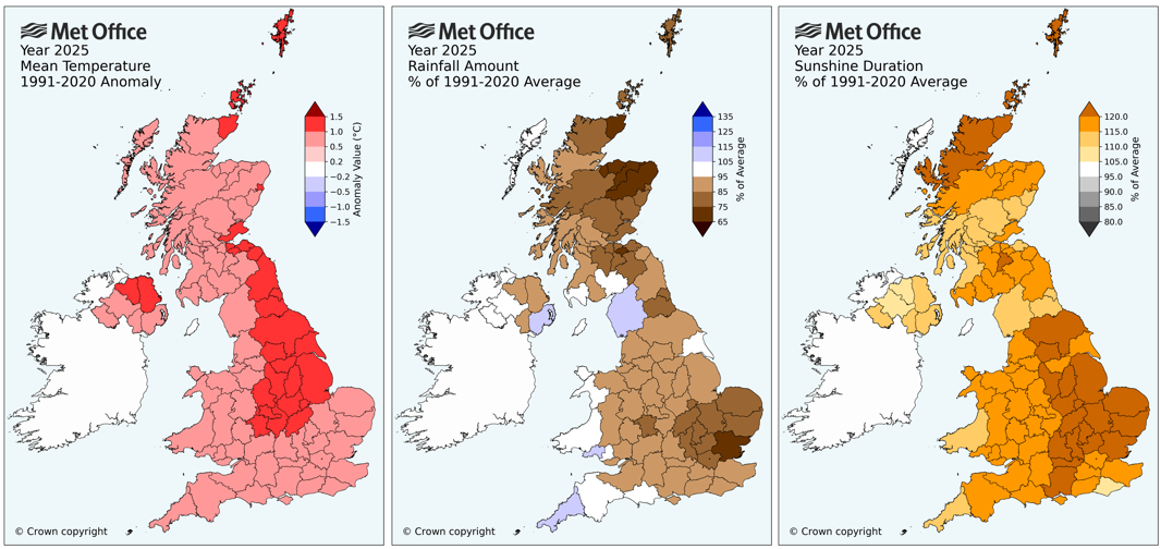
The “climate anomaly” maps below show the difference between the average temperature (left), rainfall total (middle) and sunshine duration (right) between 2025 and the 1991-2020 period. In other words, they show how much warmer, cooler, wetter, drier, sunnier or cloudier the year was than average for each county of the UK.
Maps showing anomalies in 2025 relative to a 1991-2020 reference period for temperature (C), precipitation (%) and sunshine (%). The darker shading indicates a greater departure from average. Credit: Met Office
The maps show that the whole country was warmer than average, with central and north-east England, parts of Northern Ireland and the tip of north-west Scotland, Orkney and Shetland seeing the greatest change.
The UK overall had 90% of average rainfall. The driest regions relative to average were around Essex, Moray and Aberdeenshire, which received less than 75% of normal annual rainfall.
In contrast, some western counties were slightly wetter than average – including Cornwall (110%) and Cumbria (107%).
Sunshine was above average across the UK, with eastern England and north Scotland exceeding 120% of the average.
Attribution
The UK’s absolute temperature averaged at 10.09C in 2025. This follows 2022 (at 10.03C) as the second time that the annual average temperature has exceeded 10C.
In our analysis of the UK’s climate in 2022 for Carbon Brief, we reported on a Met Office attribution study that found that human-caused climate change had increased the likelihood of UK annual absolute temperature averaging above 10C by a factor 160.
That study concluded that exceeding 10C – while unprecedented in the historical observational record – would become increasingly common and would likely occur every three-to-four years.
Three years on from that analysis and the 10C threshold has been breached for a second time – and an updated attribution analysis has been produced exploring the likelihood of a return of temperatures above the 10.09C recorded in 2025.
The study, which uses the same methodology as the 2022 paper, finds that UK annual mean temperatures above 10.09C are estimated to occur approximately every three years in the current climate. In contrast, they would have occurred around every 780 years in pre-industrial times.
Human-caused climate change has, therefore, increased the probability of average temperatures in excess of 10.09C by a factor of 260.
These results show that 2025’s record-breaking annual temperature – while unprecedented in the historical observational record – should be considered fairly normal in the current climate.
Climate projections indicate that, by the later part of the 21st century, a year like 2025 could be a relatively cool year.
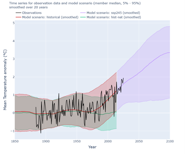
The figure below compares observations of UK annual average temperatures (black line) – relative to the long-term average – to climate model simulations that include (red/purple) or exclude (green) human-caused emissions of greenhouse gases and land-use change.
The green and red curves start to diverge from around the 1980s, suggesting that human influence is indeed the dominant factor in the warming trend. The shaded range of the simulations show that in our current and future climate, much warmer years than 2025 are plausible.
Colder years are also still possible, but it is much less likely that we would experience a cold year like 2010 – and exceptionally unlikely for a year to be in the top-10 coldest years for the UK. The most recent year to feature in the top-10 coldest years was 1963.
Timeseries of the UK annual mean temperature anomaly (w.r.t. 1901 – 1930). Observational data from HadUK-Grid (black). Simulations from the CMIP6 historical simulation including natural and human-caused drivers (red), SSP2-4.5 projections of future climate based on a “medium” emissions scenario (purple) and “hist-nat” simulations that include only natural drivers of climate such as solar and volcanic activity (green). Simulation data is represented as median values and filled 5-95th percentile ranges explored by members of the multi-model ensemble. Percentiles of simulation data are smoothed with a rolling window of 20 years, with historical and SSP2-4.5 combined into one continuous series. Observed data runs from 1884-2025. Credit: Met Office
Warmer, wetter, sunnier
Four of the UK’s last five years all appear in the top-five warmest years since 1884.
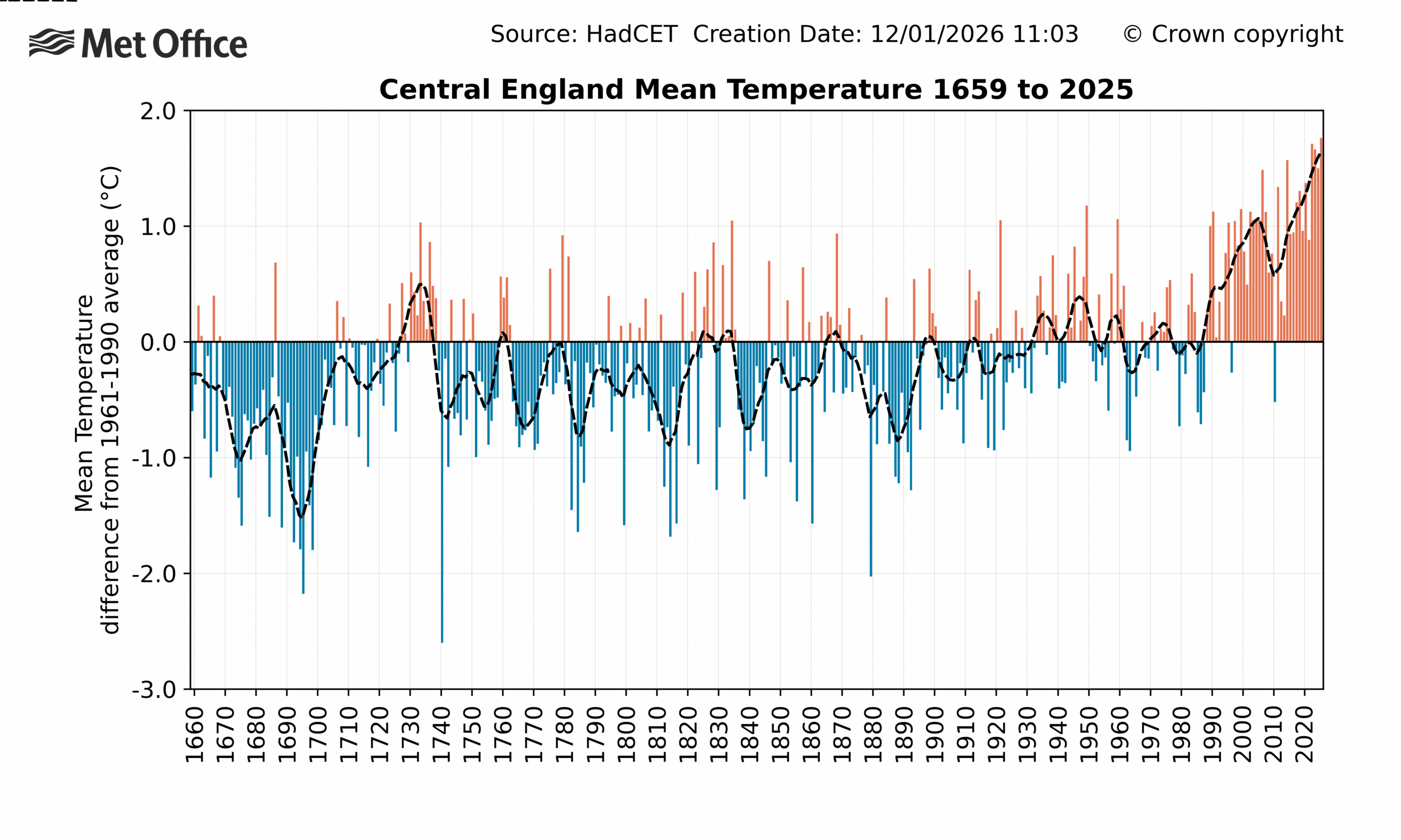
The Central England Temperature (CET) series is the longest continuous instrumental climate record in the world, dating back to 1659. Covering a region roughly enclosed by Lancashire, London and Bristol, it does not represent the whole of the UK. However, when averaged across a year and analysed across centuries, it does provide a multi-century perspective that is representative of climate variations and changes that impacted the UK.
As with the HadUK-Grid temperature record, the CET series also identifies 2025 as the warmest year on record. The longer-running temperature series identifies the same five years – in the same order – as the warmest on record. This is shown in the table below.
Year
UK (from HadUK-Grid)
Central England Temperature
2025
10.09C
11.23C
2022
10.03C
11.18C
2023
9.97C
11.13C
2014
9.88C
11.04C
2024
9.79C
10.96C
The graph below of the CET series shows that temperatures recorded in recent years are well outside the range of variability recorded over more than 300 years.
Average temperature anomalies (relative to a 1961-90 average) for each year in the CET series from 1659 to 2025. Colours show years that are above (red) or below (blue) average. The dashed line is a smoothed series to show the decadal variations and trend. Credit: Met Office
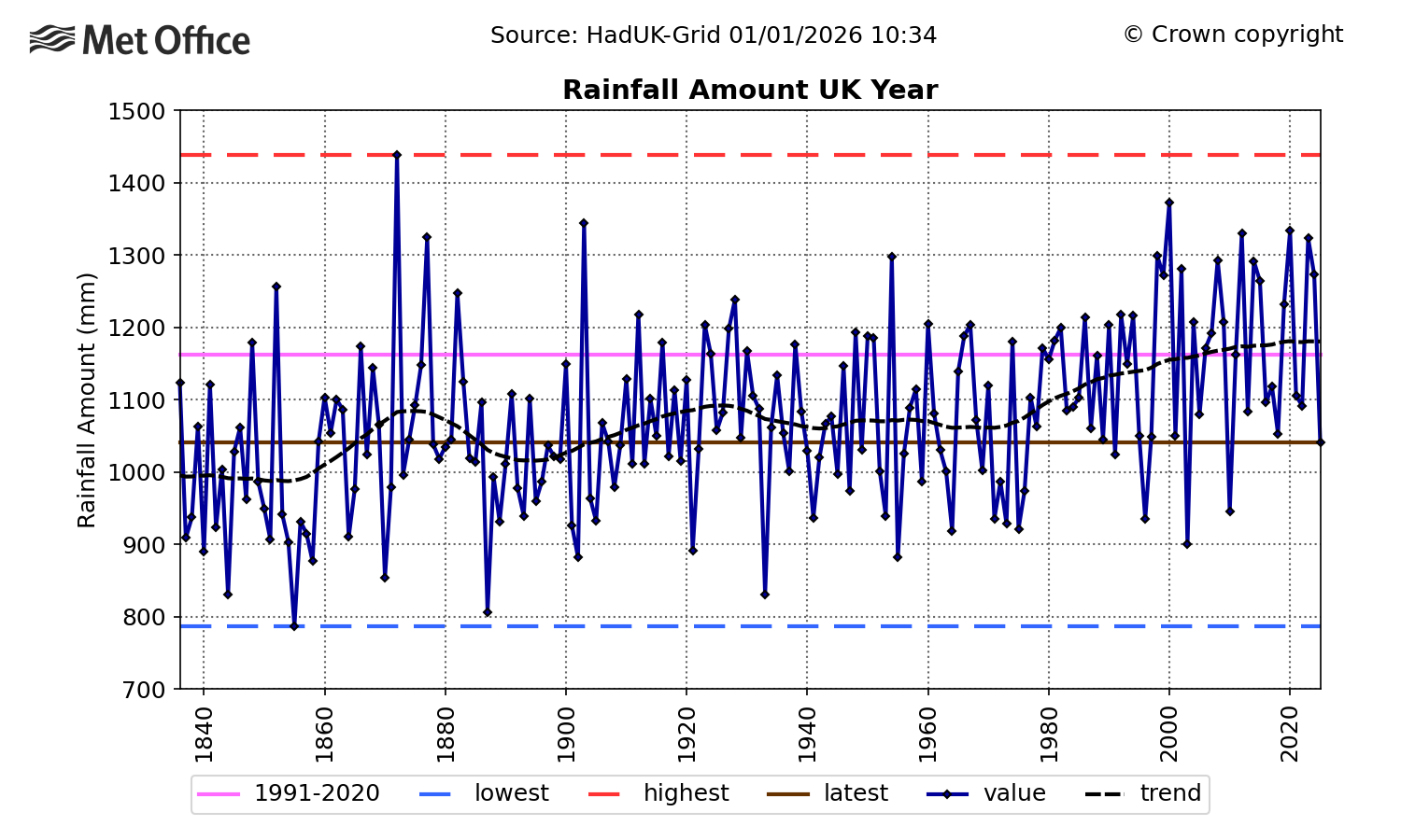
However, the UK is not only warming, it is also getting wetter and sunnier. The year 2025 was relatively dry, recording 90% of average rainfall. This made it the driest year recorded since 2010 and put it in contrast to relatively wet years in 2023 and 2024.
The longer-term trend can be seen in the figure below, which shows that 2025 was relatively dry compared to recent decades, but not exceptional in the longer-term historical context.
The last time the UK had a year in the top-10 driest was in 1955, whereas all five of the top-10 wettest years have occurred this millennium. The wettest year on record still stands as 1872.
Timeseries of UK total rainfall from 1836 to 2025. The trend is represented by a black dashed line, the 1991-2020 average is shown in pink and the highest and lowest values in the series are shown by the red and blue dashed lines, respectively. The 2025 value is represented by the horizontal brown line. Credit: Met Office
The drivers of annual rainfall trends are more complex than for temperature.
A significant factor in rainfall trends is a warming atmosphere’s ability to hold more moisture. However, this does not completely account for recent increases in rainfall.
Large-scale atmospheric circulation patterns – particularly features such as the jet stream and associated storm tracks across the North Atlantic – also play a crucial role. These are influenced by annual and decadal fluctuations in the Earth’s climate, as well as human-caused climate change.
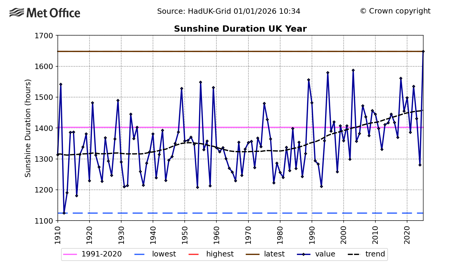
UK annual sunshine totals have also been rising since the 1980s, with 2025 setting a record by a considerable margin. This is in sharp contrast to 2024, which was the dullest year since 1998. This is shown in the graph below, where the dotted line shows the underlying long-term trend, with year-to-year variations removed.
Timeseries of UK total annual sunshine hours from 1910 to 2025. The trend is represented by a black dashed line, the 1991-2020 average is shown in pink and the highest and lowest values in the series are shown by the red and blue dashed lines, respectively. The 2025 value is represented by the horizontal brown line (which covers the red line for the highest in the record). Credit: Met Office
The cause of the sunshine trend is also uncertain, with both natural climate variability and human activity (through reduced regional air pollution caused by a reduction in aerosol emissions) potential contributors. Climate projections do not provide any strong evidence for how sunshine trends might develop.
The year in storms
The Met Office has been naming storms since 2015. Each storm-naming period runs from September to August.
(For more on storm naming in the UK, read Carbon Brief’s explainer.)
The criteria for storm naming has changed over time. It accounts for meteorological conditions, as well as the potential severity of impacts. As a result, comparisons between years can indicate relative levels of storm activity, but should not be done on a like-for-like basis.
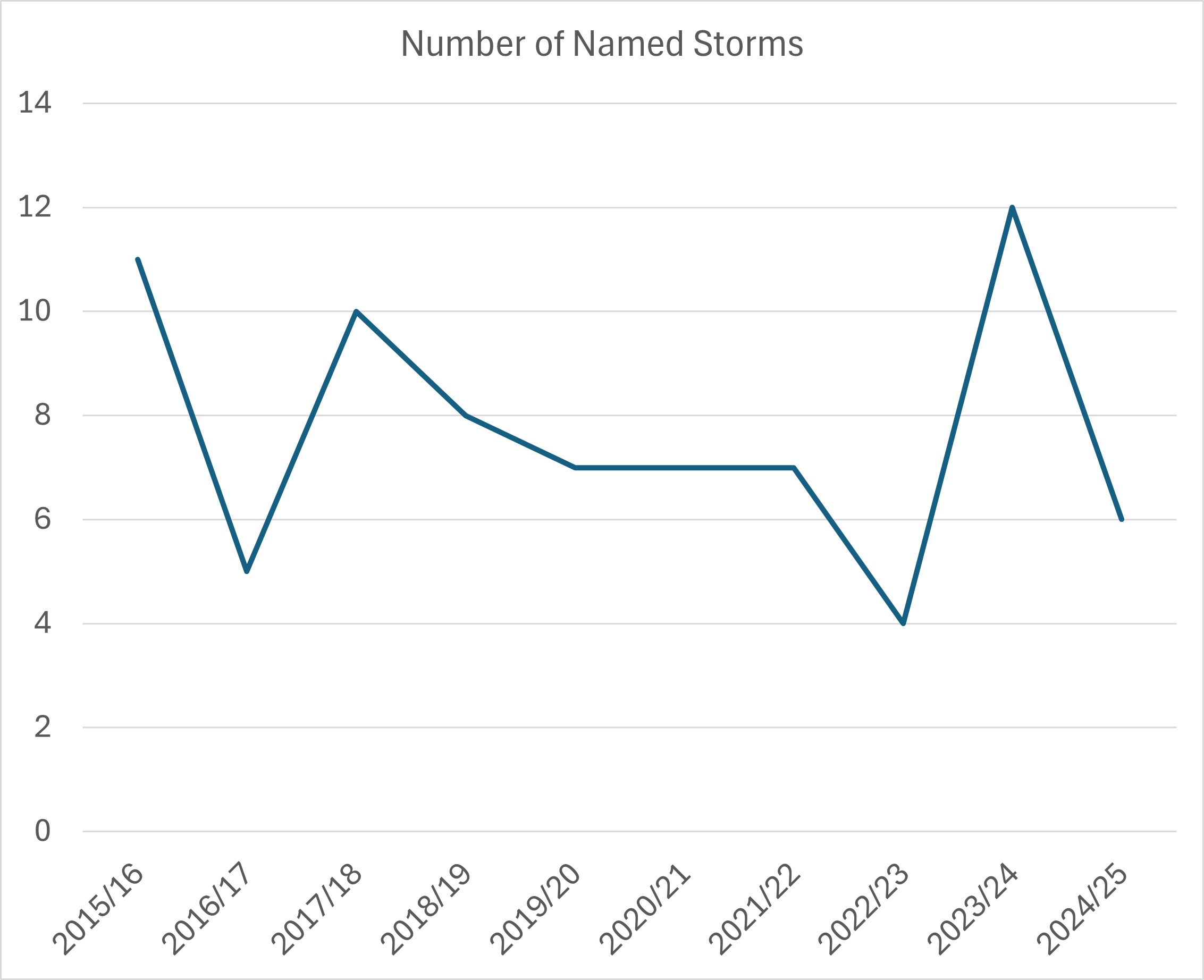
Between the 2015-16 and 2024-25 storm seasons, there have been, on average, 7.7 named storms each year, with a high of 12 recorded in the 2023-24 season and a low of four over 2022-23. This is shown in the line chart below.
Timeseries of the number of named storms for each storm-naming period (which runs from September to August) since 2015. It includes storms named by other Met Services that impacted the UK. Source: Met Office
By this measure, 2025 was not exceptional with six named storms – two from the 2024-25 season and four from 2025-26. These are listed in the table below.
Storm name
Date(s) of impact in UK
Maximum wind gust
Notable features
2024-25 names
Éowyn
24 January
87Kt (100mph), Drumalbin, Lanarkshire
Most powerful storm for over a decade
Floris
4-5 August
71Kt (82mph) at Wick Airport, Caithness
Equalled Scotland’s August gust speed record
2025-26 names
Amy
3-4 October
83Kt (96mph) at Tiree, Argyll
Significant disruption from flooding.
Benjamin (named by Meteo France)
22-23 October
52Kt (60mph) Needles, Isle Of Wight
Strongest winds affected northern France
Claudia (named by AEMET, Spain)
14 November
59Kt (68mph) Warcop Range, Cumbria
Extensive heavy rainfall across England and Wales
Bram
8-10 December
73Kt (84mph), Capel Curig, Conwy
Flooding from heavy rainfall on saturated ground.
Credit: Met Office storm centre
Storm Éowyn in January had the most severe winds of any storm in 2025. The Met Office issued a red warning for wind across Northern Ireland and the south-west and central belt of Scotland. An amber warning was issued for the northern half of the UK. At the peak of the storm, power outages were reported at around 1m homes.
Storms from October to December were notable for bringing some persistent and heavy rain during a period of wetter weather, in contrast to the extended dry spell earlier in the year.
Weather through the year
The charts below show the progression of temperature and rainfall through the course of 2025.
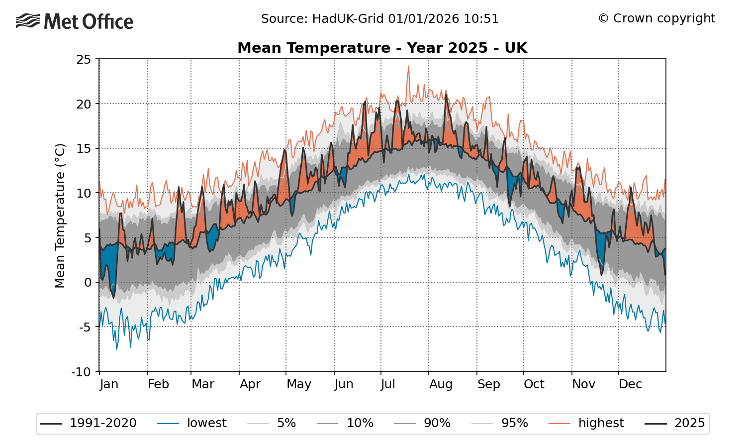
The plot below charts average daily temperature over the course of 2025, with orange shading showing warmer-than-average conditions. Overall, the year had 244 days – 66% of the total – where temperatures were above average.
On the other hand, cold spells – indicated by blue shading – were generally short-lived and not very severe, with the exception of events in early January and November.
Timeseries of daily UK average temperature during 2025. Orange shading indicates periods of above-average temperature and blue shading below average. The solid black line is the 1991-2020 reference period by day of the year. The grey shading reflects the 5th, 10th, 90th and 95th percentiles of the temperature distribution and the red and blue lines are the highest and lowest values for each day of the year, based on a dataset of daily data from 1960. Credit: Met Office
Fifty-one days in 2025 were in the top 5% warmest for the time of year in the historical record, but only one day – 20 November – was in the 5% of coldest.
The significant number of warmer days and absence of cool ones helps build a picture of how 2025 was the warmest year overall.
The highest daily maximum temperature recorded in the year was 35.8C at Faversham, Kent on 1 July during an early summer heatwave. The lowest minimum temperature was -18.9C, recorded at Altnaharra, Sutherland on 11 January.
A maximum annual temperature of 35.8C is not an exceptional high for recent years – especially when compared with 2022’s record of 40.3C. However it would have been a rare event in the 20th century, when just three years – 1932 (36.1C), 1976 (35.9C) and 1990 (37.1C) – saw a higher temperature.
In the 21st century, six years have seen temperatures above 35.8C – 2003, 2006, 2015, 2019, 2020, and 2022.
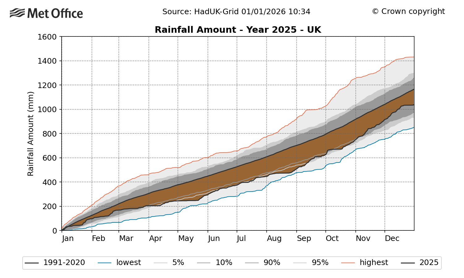
The plot below illustrates 2025’s below-average rainfall accumulation.
The brown shading – which represents the deficit in rainfall at that point of the year compared to the 1991-2020 average – highlights how rainfall totals were particularly low during the dry spring and summer period. The lower blue line shows how rainfall accumulation in 2025 came close to – but did not quite reach – a record low in late May and late August.
Wetter conditions in the autumn saw rainfall totals recover a little to reach 90% at the end of the year – which is below average, but not exceptional. As noted previously, there were regional variations.
Timeseries showing rainfall accumulation through 2025 for the UK. Brown shading represents a deficit in rainfall compared to average for that point in the year, and blue shading is an excess of rainfall compared to average. The solid line represents the 1991-2020 average and grey shading shows the 5th, 10th, 90th and 95th percentiles of the distribution. The blue and red lines represent the lowest and highest values based on a dataset of daily rainfall from 1891 to 2022. Credit: Met Office
Winter
In climate terms, the UK winter spans the calendar months of December, January and February.
The winter of 2024-25 was slightly warmer than average, but not exceptional, with an average temperature of 4.62C. This is 0.53C above the 1991-2020 average. The winter months had 89% of average rainfall and 94% of average sunshine.
New Year’s Day saw significant flooding that affected parts of Lancashire and the south side of Manchester. The River Mersey reached record levels in the wake of two days of heavy, persistent rain.
The coldest spell of 2025 occurred in early January, with significant snowfall in some regions.
Storm Éowyn and heavy rain at the end of January were the winter’s most impactful events, bringing high winds and flooding that resulted in considerable disruption.
Spring
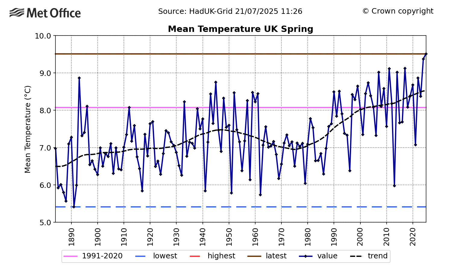
Spring – which encompasses the months of March, April and May – was the warmest and sunniest on record, as well as the sixth driest.
The record high temperature came only one year after the previous record set in 2024, continuing a trend of increasing spring time temperature for the UK.
(A Met Office attribution analysis which explored the record-breaking temperatures of May 2024 showed that the temperatures were caused by a combination of a marine heatwave which persisted through May and into June and human-induced climate change.)
The timeseries below shows average spring temperature in the UK over 1884-2025. It shows a significant warming trend since the 1970s, with temperatures in 2024 and 2025 sitting well outside the range of variability observed in the late 19th and 20th centuries.
Timeseries of spring average absolute temperature for the UK over 1884-2025. The trend is represented by a black dashed line, the 1991-2020 average is shown in pink and the highest and lowest values in the series are shown by the red and blue dashed lines, respectively. The 2025 value is represented by the horizontal brown line (which covers the red line for the highest in the record). Credit: Met Office
The UK’s changing climate is having an impact on the natural cycles of many species and habitats. Citizen science initiatives have highlighted how “signs of spring” – for instance, the first flowering or first nest-building – occur increasingly early in the year.
Summer
Warm, sunny and dry conditions persisted into the summer season, drying out soils.
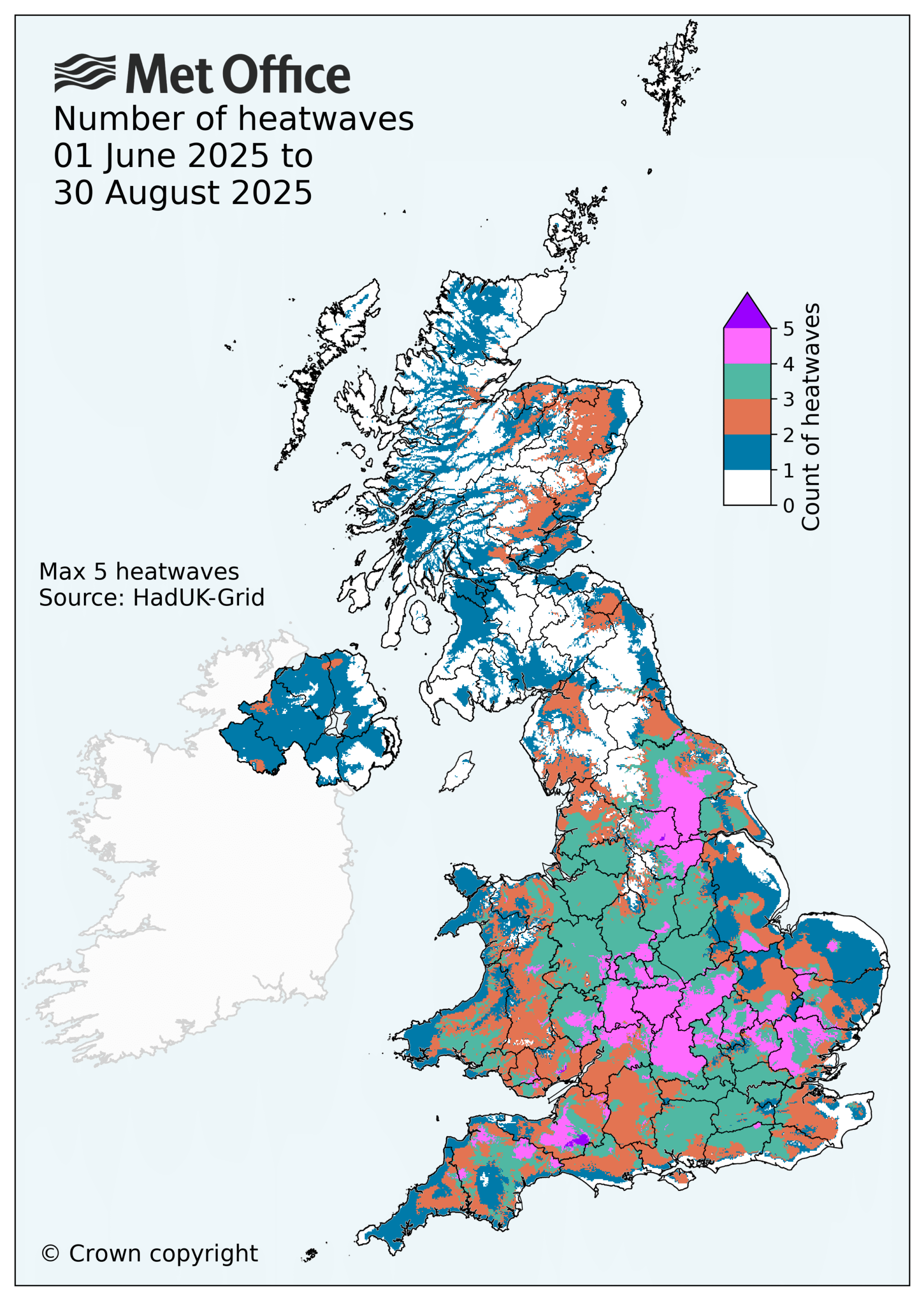
There were four heatwave events, which impacted almost all regions of the UK. Two of these events took place in June.
A marine heatwave also took place, with sea surface temperatures of 1.5-3C above the 1983-2012 average in the Celtic Sea, English Channel and southern North Sea.
An attribution study by the World Weather Attribution service estimated that human-caused climate change had made exceeding June heatwave thresholds around 10 times more likely. The research also found that one of the June heatwaves had been made 2-4C more intense as a result of human influence.
The five warmest summers recorded in the UK to date are 2025 (16.10C), 2018 (15.76C), 2006 (15.75C), 2003 (15.74C) and 2022 (15.71C).
Met Office analysis estimates that in a pre-industrial climate, a summer like 2025 would be expected to occur every 340 years. However, in the current climate, we could expect to see these sorts of summers roughly once every five years.
The study also shows that the UK could plausibly experience much hotter summers in the current and future climate. Events that would have been seen as extremes in the past are becoming more common.
A Met Office attribution study published in 2019 estimated that the then record-breaking summer of 2018 had a statistical return period of approximately eight-to-nine years. The summer of 2025 has broken that record in seven years, consistent with these previous findings.
The science is clear that UK summers are becoming warmer and extreme heat events are becoming more common. This could mean more significant impacts on people, infrastructure and the environment – both now and in the future.
The map below plots the number of heatwaves that took place in June, July and August across the UK. It shows how a significant number of regions across saw three (green shading) or four (pink shading) heatwaves over the summer months.
Map showing the number of heatwaves by location during the summer of 2025. Source: Met Office
Autumn
Autumn and the month of December were marked with unsettled weather, with mild and wet conditions over the four-month period.
The season was warmer and wetter than average. Northern Ireland had its third-wettest autumn on record, Northern England its fifth wettest and Wales its 10th wettest.
Storm Amy set a record for highest gust speed for a storm in October, with 80Kt (92mph) recorded at Magilligan, County Londonderry.
Other major storms were notable for heavy rainfall that caused flooding. Storm Claudia brought heavy rainfall to central England and Wales in mid-November, which fell on already saturated ground.
The second half of November saw snow cause across the North York Moors during a cold northerly spell which saw some hard frosts. This was followed by generally mild and unsettled conditions until late December, when strong easterly winds brought more low temperatures and hard frosts.
The UK chalked up a number of significant climate records in 2025, particularly for high temperatures. This aligns with the well-established warming trend that is the result of human-caused climate change.
Climate attribution studies continue to provide further evidence that human factors are increasing the likelihood and severity of UK climate extremes.
Many of 2025’s records will not stand for long. There is a high chance they will be broken again in the near future as the climate continues to warm.
Donald Trump urges you to be a Climate Science denier like him. He says that he makes millions and millions for destroying the planet, Burn, Baby, Burn and Flood, Baby, Flood.Nigel Farage urges you to ignore facts and reality and be a climate science denier like him and his Deputy Richard Tice. He says that Reform UK has received £Millions and £Millions from the fossil fuel industry to promote climate denial and destroy the planet.Elon Musk urges you to be a Fascist like him, says that you can ignore facts and reality then.
The year 2025 was in the top-three warmest years on record, with average surface temperatures reaching around 1.44C above pre-industrial levels across eight independent datasets.
The different temperature records confirm that last year was either the second or third warmest since observations began in the mid-1800s, with razor-thin margins between 2025 and 2023.
Last year also set a new record for ocean heat content, with the oceans absorbing more than 90% of the heat trapped by increasing greenhouse gas concentrations in the atmosphere.
Here, Carbon Brief examines the latest data across the Earth’s oceans, atmosphere, cryosphere and surface temperature. (Use the links below to navigate between sections.)
Noteworthy findings from this 2025 review include…
Ocean heat content: It was the warmest year on record for ocean heat content and one of the largest year-over-year increases in ocean heat content. In 2025, the oceans added 39 times more heat than all annual human energy use.
Global surface temperatures:The year 2025 is effectively tied with 2023 as the second-warmest year on record – coming in at between 1.33C and 1.53C above pre-industrial levels across different temperature datasets and 1.44C in the synthesis of all groups.
Second warmest over land: Global temperatures over the world’s land regions – where humans live and primarily experience climate impacts – were 2C above pre-industrial levels, just below the record set in 2024.
Third warmest over oceans: Global sea surface temperatures were 1C above pre-industrial levels, dropping from 2024 record levels due to fading El Niño conditions.
Regional warming: It was the warmest year on record in areas where, collectively, more than 9% of the global population lives.
Unusual warmth: The exceptionally warm, record-setting temperatures over the past three years (2023-25) were driven by continued increases in human emissions of greenhouse gases, reductions in planet-cooling sulphur dioxide aerosols, variability related to a strong El Niño event and a strong peak in the 11-year solar cycle.
Greenhouse gases: Concentrations reached record levels for carbon dioxide (CO2), methane and nitrous oxide.
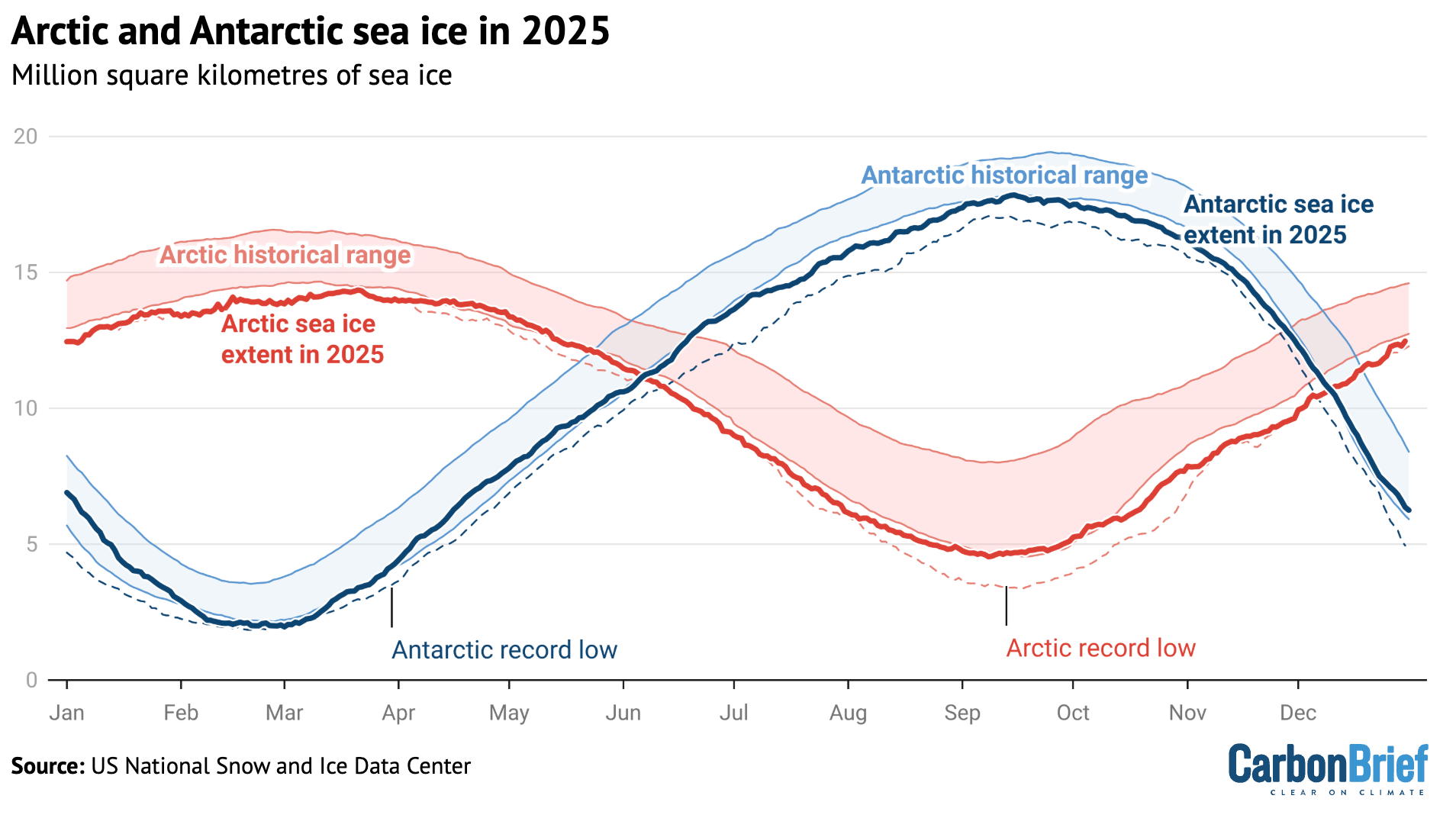
Sea ice extent: Arctic sea ice saw its lowest winter peak on record as well as its 10th-lowest summer minimum extent, while Antarctic sea ice saw its third-lowest minimum extent.
Looking ahead to 2026: Carbon Brief predicts that global average surface temperatures in 2026 are likely to be between the second and fourth warmest on record, similar to 2023 and 2025, at around 1.4C above pre-industrial levels.
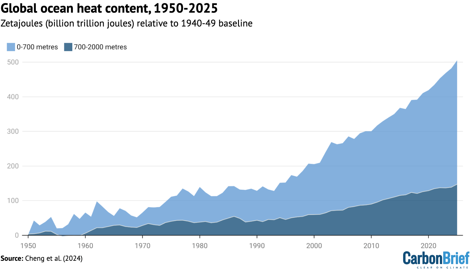
Ocean heat content sets a new record
The year 2025 was the warmest on record for the heat content of the world’s oceans.
Ocean heat content (OHC) increased by around 500 zettajoules – billion trillion joules – since the 1940s.
The heat increase in 2025 alone compared to 2024 – about 23 zettajoules – is around 39 times as much as the total energy produced by all human activities on Earth in 2023 (the latest year in which global primary energy statistics are available). It was also the largest increase in ocean heat content since 2017 (following the strong El Niño event of 2016).
Human-emitted greenhouse gases trap extra heat in the atmosphere. While some of this warms the Earth’s surface, the vast majority – around of 93% – goes into the oceans. About two-thirds of this accumulates in the top 700 metres, but some also ends up in the deep oceans.
The figure below shows annual OHC estimates from the Chinese Institute for Atmospheric Physics (IAP) between 1950 and present for the upper 700 metres (light blue shading) and 700-2,000 metres (dark blue) of the ocean.
Annual global ocean heat content (in zettajoules – billion trillion joules, or 10^21 joules) for the 0-700 metre and 700-2,000 metre layers. Data updated from Cheng et al. (2024). Chart by Carbon Brief.
In a new paper published last week, researchers found that the rate of OHC increase over the past 15 years is unprecedented over the observational record in the IAP dataset. More broadly, there has been a distinct acceleration in OHC after 1991 – and recent OHC growth rates are generally consistent with satellite measurements of Earth energy imbalance (EEI).
(Energy imbalance is a measure of how much surplus heat there is in the Earth’s climate system. It is the difference between how much energy enters Earth’s atmosphere from the sun and how excess heat is radiated back into space as the world warms.)
In many ways, OHC represents a much better measure of climate change than global average surface temperatures, because it is where most of the extra heat ends up and is much less variable on a year-to-year basis than surface temperatures.
The analysis reveals that global surface temperatures were between the second and third warmest since records began in the mid-1800s. Temperatures effectively tied with 2023 within the margin of uncertainty, below the record set last year in 2024.
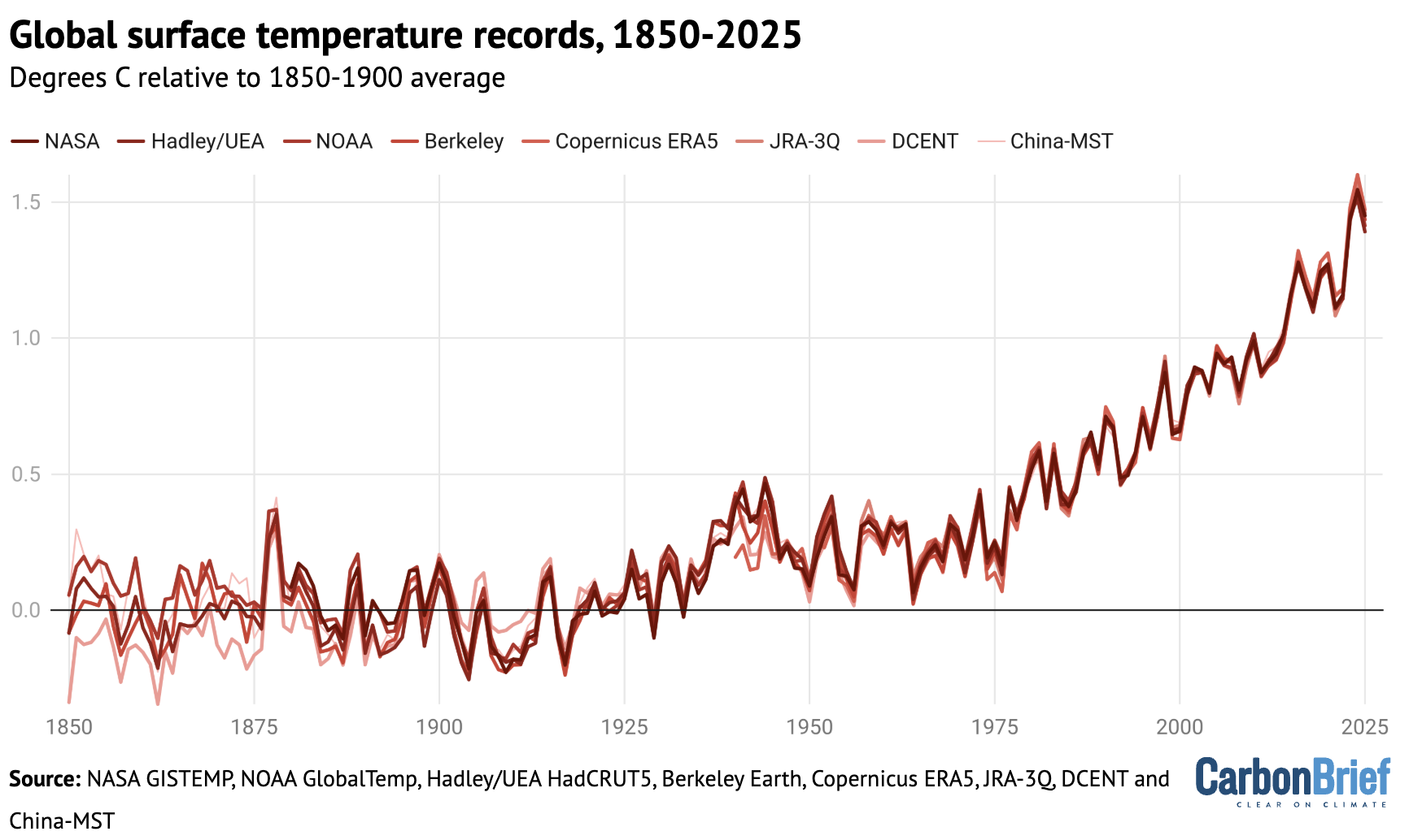
The figure below shows global surface temperature records from the eight datasets.
Global surface temperature records can be calculated back to 1850, though some groups such as NASA GISTEMP choose to start their records in 1880 when more data was available.
Prior to 1850, records exist for some specific regions, but are not sufficiently widespread to calculate global temperatures with high accuracy (though newly published research has attempted to extend this back to 1781).
These longer surface temperature records are created by combining ship- and buoy-based measurements of ocean sea surface temperatures with temperature readings of the surface air temperature from weather stations on land. (Copernicus ERA5 and JRA-3Q are an exception, as they use weather model-based reanalysis to combine lots of different data sources over time.)
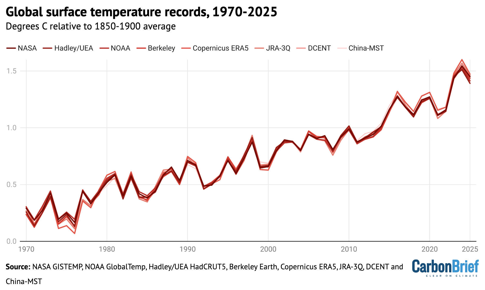
Some differences between temperature records are apparent early in the record, particularly prior to 1900 when observations are more sparse and results are more sensitive to how different groups fill in the gaps between observations. However, there is strong agreement between the different temperature records for the period since 1970, as shown in the figure below.
Annual global average surface temperatures as in the prior chart, but showing the period from 1970-2025. Chart by Carbon Brief.
Global temperatures over the past three years clearly stand out as much warmer than anything that has come before, well above the prior record set in 2016. More broadly, the 11 warmest years on record all happened in the past 11 years.
Two of the eight datasets analysed by Carbon Brief – NASA and DCENT – had 2025 as the second-warmest year behind 2024, while six of the datasets had 2025 as the third-warmest year behind both 2023 and 2024.
However, in nearly all cases the difference between 2023 and 2025 falls within each dataset’s published uncertainty range, making it effectively a tie between the two years.
The table below shows the reported 2025 global temperature anomalies (relative to each group’s 1850-1900 pre-industrial baseline), as well as a 2025 value using a common pre-industrial baseline between the 1850-1900 and 1981-2010 periods across the five groups with data back to 1850 (NOAA, Hadley/UEA, Berkeley Earth, DCENT and China-MST).
Dataset
2025 Reported
2025 With common baseline
Ranking
NASA GISTEMP
1.39
1.45
Second
Hadley/UEA HadCRUT5
1.41
1.39
Third
NOAA GlobalTemp
1.33
1.41
Third
Berkeley Earth
1.44
1.44
Third
Copernicus ERA5
1.47
1.47
Third
JRA-3Q
1.46
1.46
Third
DCENT
1.53
1.44
Second
China-MST
1.39
1.42
Third
Reported temperature anomalies range from as low as 1.33C (NOAA) to as high as 1.53C (DCENT), primarily reflecting differences in the early part of the record. The 2025 values with a common baseline have a much smaller range, from 1.41C (NOAA) to 1.47C (Copernicus).
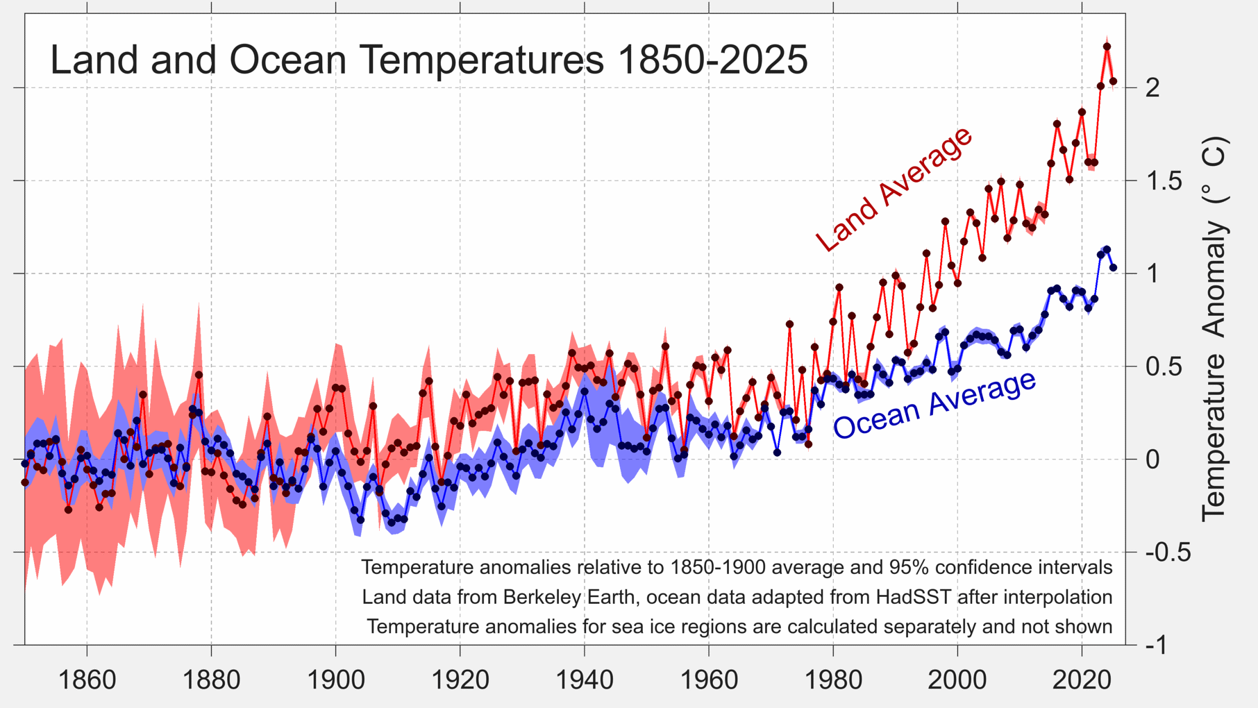
Separate land and ocean temperatures are not available yet from all of these groups. However, Berkeley Earth reports that global land temperatures in 2025 were the second warmest on record, at 2.03C above pre-industrial levels, while ocean temperatures were the third warmest at 1.03C.
Land and ocean temperature rise since the pre-industrial 1850-1900 period. Figure from Berkeley Earth.
Global land regions – where the global human population lives – has generally been warming around 70% faster than the oceans and 40% faster than the global average since 1970.
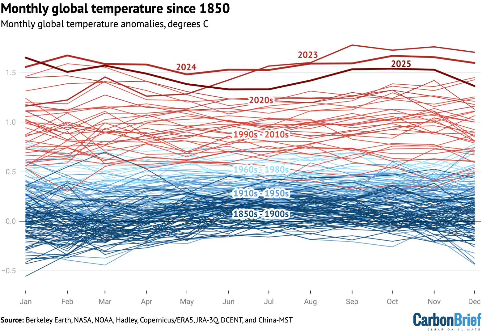
The year started off quite hot, with January 2025 setting a new record as the warmest January. All other months of the year ended up being either the second or third warmest on record after 2024 and 2023.
The figure below shows each month of 2025 in dark red, compared to all prior years since 1850. Each year is coloured based on the decade in which it occurred, with the clear warming over time visible, as well as the margin by which both 2023, 2024 and 2025 exceeded past years.
Monthly global surface temperatures for each year since 1850, using the average of the eight different temperature datasets assessed by Carbon Brief. Anomalies are shown relative to the pre-industrial 1850-1900 period.
Extreme regional temperatures
While the globe as a whole was tied as the second warmest on record, many different regions of the planet set new records in 2025.
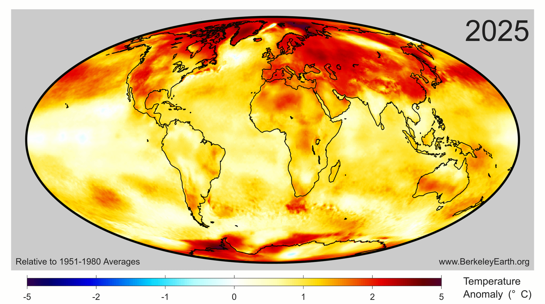
The figure below shows how global temperature deviated from the average in 2025 across the world. Areas shaded in red were warmer than the baseline period (1951-80) used by Berkeley Earth, whereas the few blue areas experienced cooler temperatures.
Collectively, approximately 770 million people – 9.3% of Earth’s population – live in places that experienced their warmest year on record in 2025. This was mostly concentrated in Asia, including around 450 million people in China.
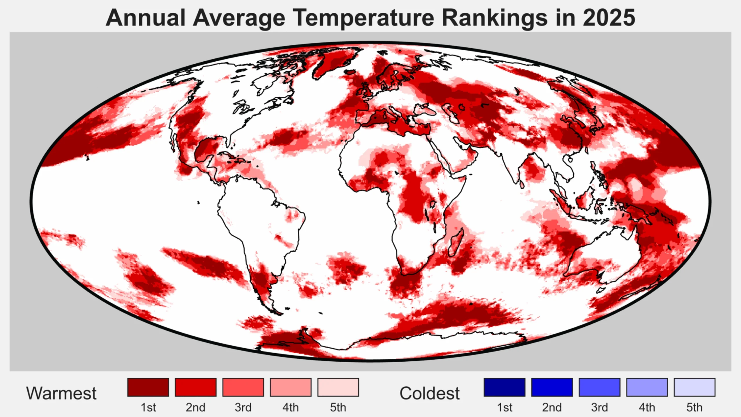
The figure below highlights regions of the planet that experienced their top-five warmest (red shading) or coldest (blue) temperatures on record in 2025. Overall, around 9% of the planet set a new record, including 11% of the land and 8% of the ocean. No location on the planet experienced record cold temperatures – or even top-five record cold temperatures – for the year as a whole.
Regions of the world among the five warmest (reds) of five coolest (blues) on record for average annual temperatures in 2025. Figure from Berkeley Earth.
Drivers of recent record warmth
Global temperatures over the past three years have been unusually warm, well above what would be expected given the long-term warming trend of around 0.2C per decade since the 1970s.
Recent research has found that global warming has accelerated in recent years to around 0.27C per decade, though this acceleration is largely in-line with climate model projections under scenarios where greenhouse gas emissions continue to rise while emissions of planet cooling aerosols are reduced.
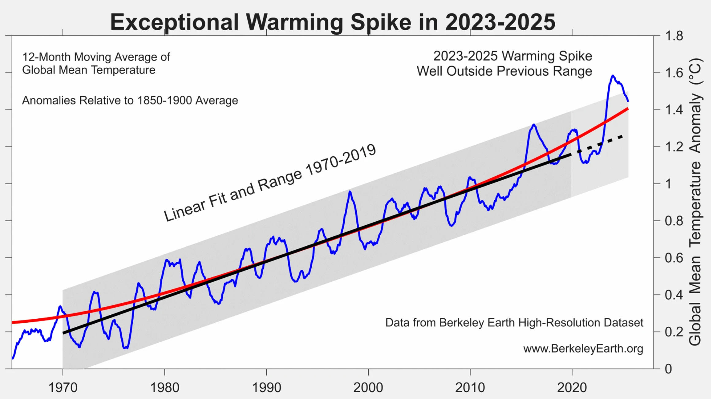
According to analysis from Berkeley Earth, the odds of global temperatures over 2023-25 occurring as a result of greenhouse gas emissions and natural variations in the Earth’s climate alone “is less than one-in-100” and “likely indicates that recent years have been impacted by additional warming factor(s)”.
The figure below shows how the exceptional warming spike of 2023-25 compares to the longer-term warming trend and historical climate variability.
Global surface temperatures between 1965 and 2025 (blue) along with the linear trend (black) and range (grey) from 1970-2019. The red line shows a locally linear regression that captures recent acceleration. Figure from Berkeley Earth.
Carbon Brief recently explored the drivers of recent warmth in more detail, finding that it is likely to have been driven by a combination of:
A strong El Niño event that developed in the latter part of 2023.
An unusual volcanic eruption in Tonga in 2022 that put a large amount of aerosols and water vapor into the upper atmosphere.
A stronger-than-expected solar cycle.
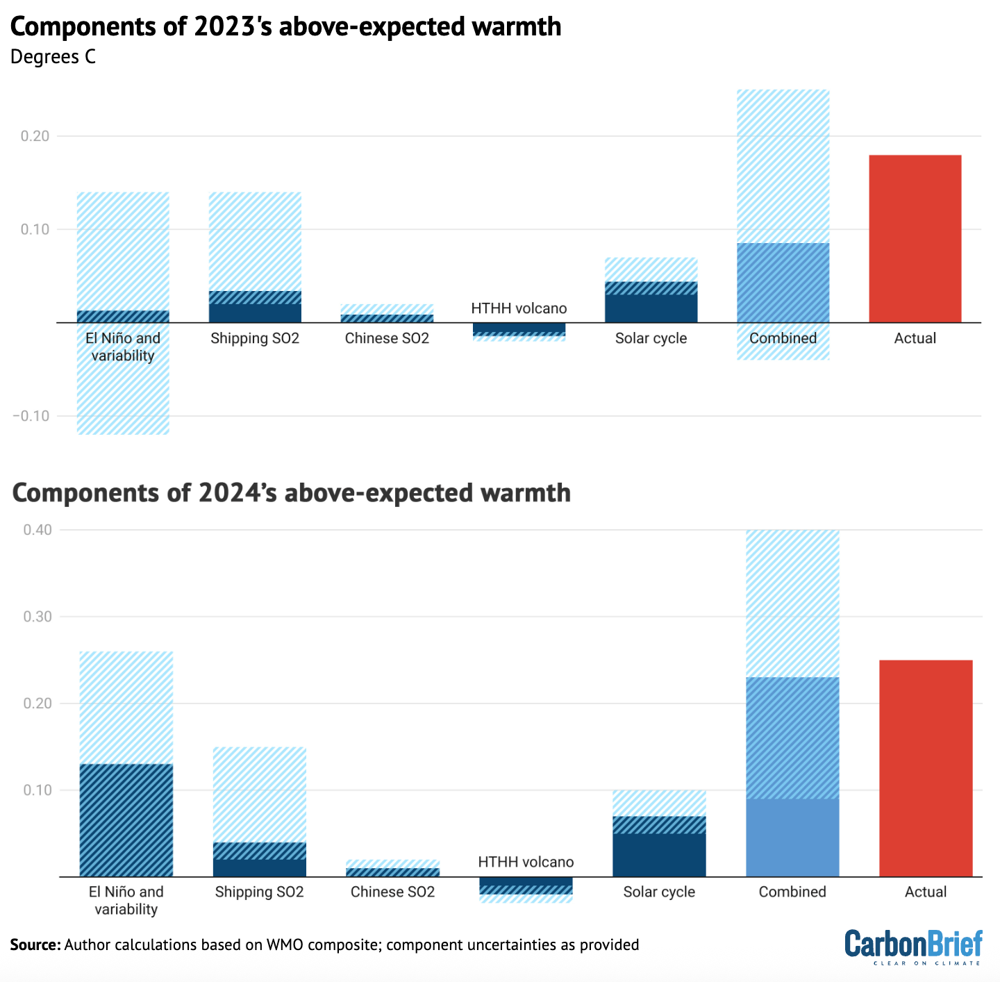
This is illustrated in the figure below, which provides an estimate of the impact of each of these different factors on 2023 and 2024 temperatures, along with their respective uncertainties.
The sum of all the factors is shown in the “combined” bar, while the actual warming compared to expectations is shown in red. The upper chart shows 2023, while the lower one shows 2024.
Attribution of 2023 and 2024 unusual warmth. Light blue bars show individual factors and their uncertainties, the dark blue bar shows the combined effects and combination of uncertainties and the red bar shows the actual warming compared with expectations. HTHH refers to the Hunga Tonga-Hunga Ha’apai volcano. Adapted from Figure 12 in WMO’s state of the global climate 2024 report.
The first bar includes both El Niño and natural year-to-year climate variability; the height of the bar reflects the best estimate of El Niño’s effects, while the uncertainty range encompasses year-to-year variability in global temperatures that may be – at least in part – unrelated to El Niño.
While a similar analysis has yet to be undertaken for 2025, the end of El Nino conditions and the development of a modest La Nina would have driven temperatures down, while the warming impact of shipping, Chinese aerosol declines would have slightly increased. The warming effect of the solar cycle would likely have remained flat or slightly declined as solar cycle 25 passed its peak.
Finally, a World Meteorological Organization (WMO) assessment of the Hunga Tonga-Hunga Ha’apai volcano found that “the record-high global surface temperatures in 2023-24 were not due to the Hunga eruption”.
The report suggested that the volcano had a small cooling effect (-0.03C) globally in 2023 and 2024. This might switch to a small warming effect (+0.03C) in 2025 and 2026 as the planet-cooling aerosols from the volcano fall back down to the surface but some of the stratospheric water vapour remains, it noted.
However, it added, these effects are “indistinguishable from background variability in the current climate”.
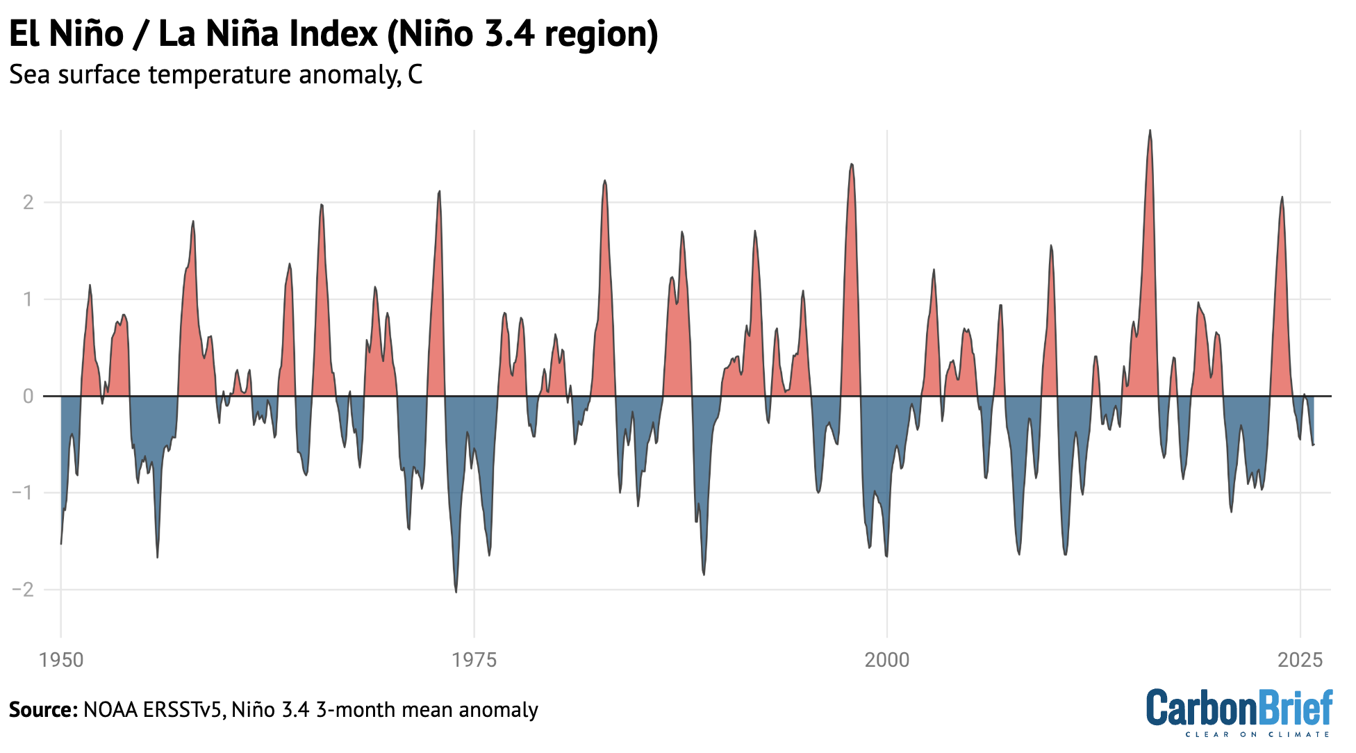
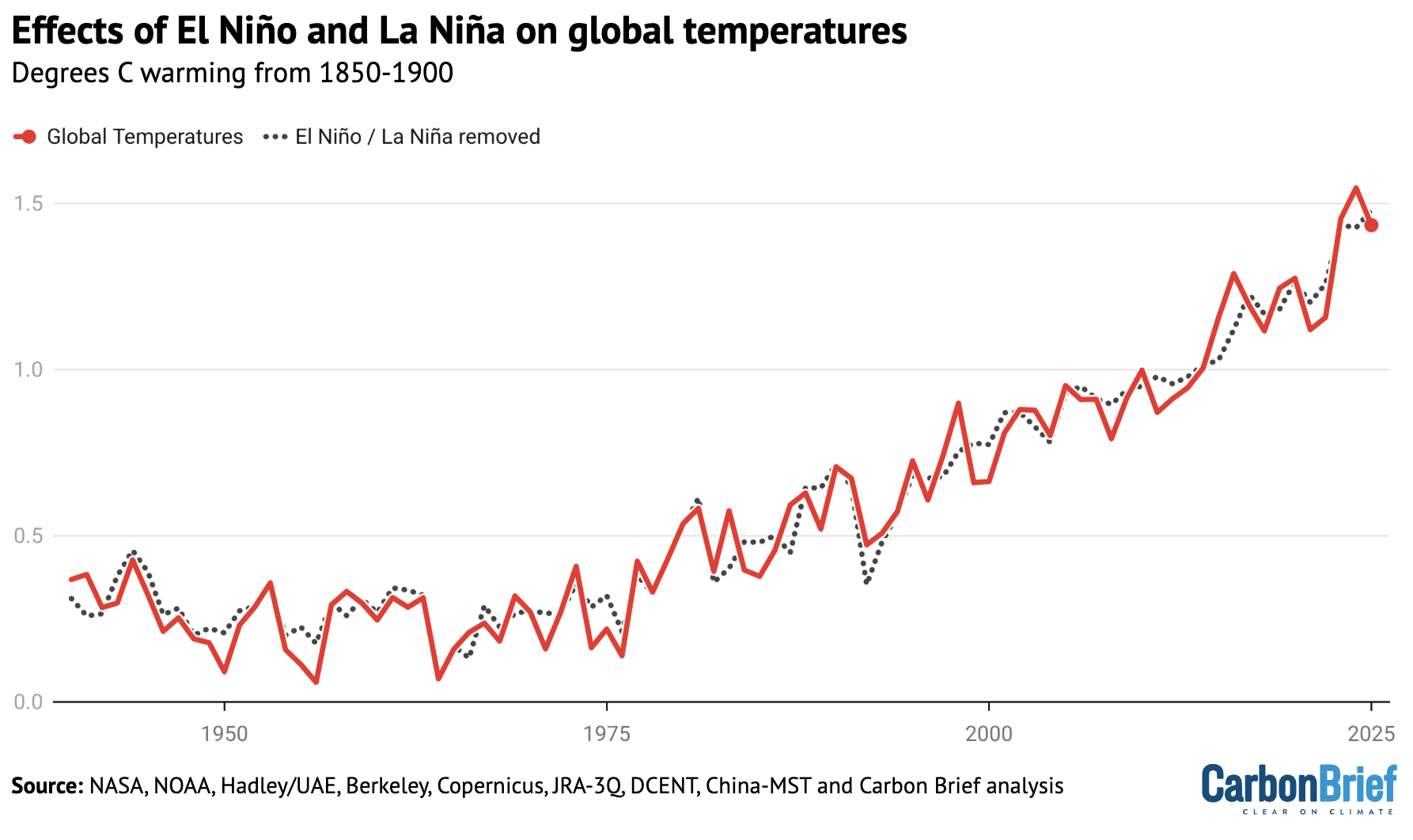
El Niño and La Niña are generally the largest drivers of year-to-year variability in global temperatures. The figure below shows the El Niño (red shading) and La Niña (blue) conditions over the past 40 years (collectively referred to as the El Niño-Southern Oscillation, or “ENSO”).
Carbon Brief has used the historical relationship between ENSO conditions and temperature to effectively remove the effects of El Niño and La Niña events from global temperatures, as shown in the figure below.
This analysis indicates that El Niño cooled global temperatures in 2025 around -0.05C, following a boost to global temperatures of around 0.12C in 2024, compared to the estimate of global temperatures with both El Niño and La Niña events removed.
Annual global average surface temperatures from the average of the eight datasets, as well as Carbon Brief’s estimate of global temperatures with the effect of El Niño and La Niña (ENSO) events removed using the Foster and Rahmstorf (2011) approach. Chart by Carbon Brief.
This suggests that the shift from El Nino to La Nina conditions can fully explain the decline in global temperatures between 2024 and 2025 and that 2025 would have likely been the warmest year in the observational record if it had not been for the effects of ENSO.
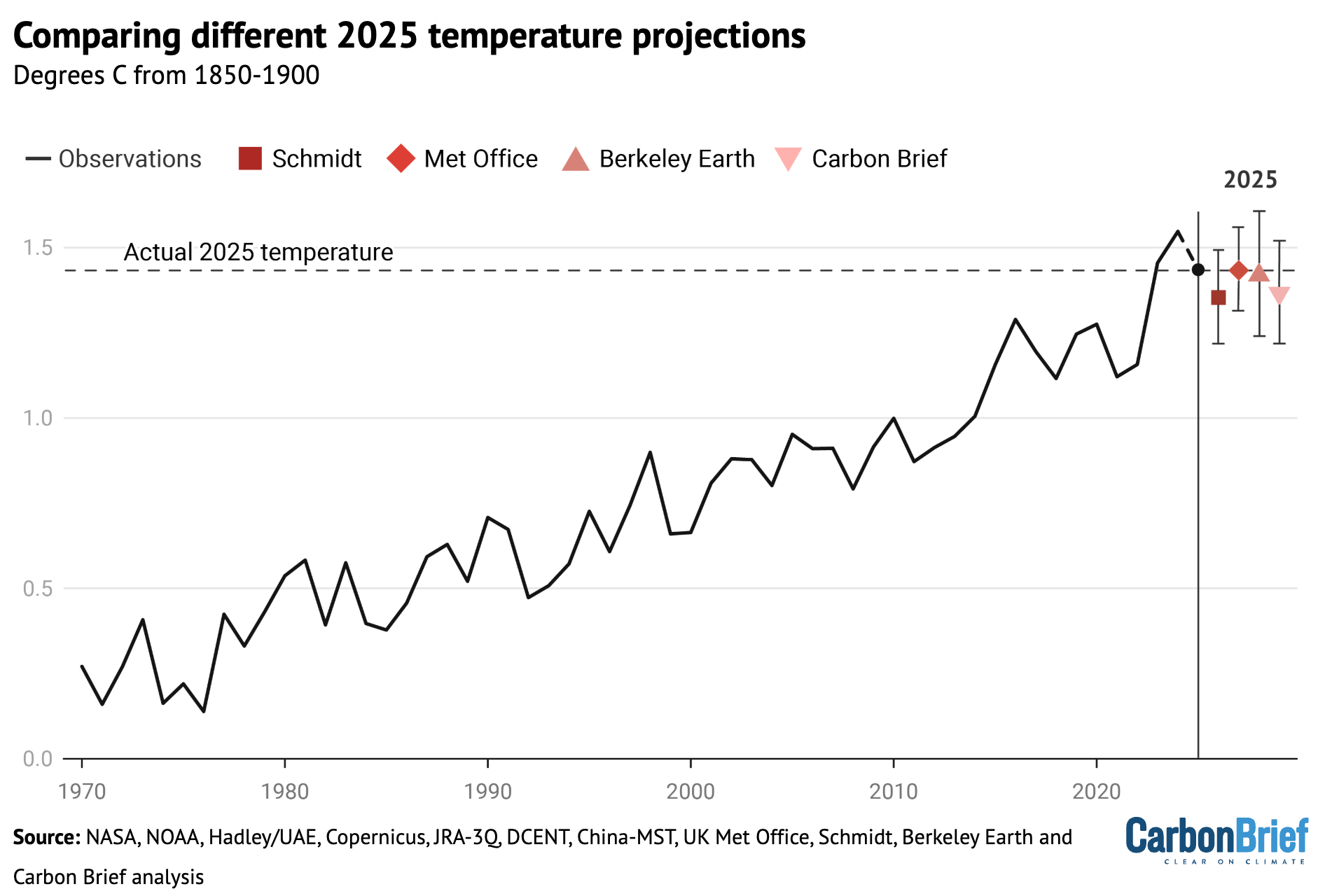
Scientists provided estimates of where they expected 2025 temperatures to end up at the start of the year.
The figure below shows estimates by four different groups that provided temperature predictions for the year prior to any data being collected – the Met Office, NASA’s Dr Gavin Schmidt, Berkeley Earth and Carbon Brief’s own estimate — compared to what actually transpired.
Temperature predictions for 2025 from UK Met Office, NASA’s Dr Gavin Schmidt, Berkeley Earth and Carbon Brief’s estimate relative to pre-industrial (1850-1900) temperatures and compared to the historical average of the eight observational datasets. Chart by Carbon Brief.
Unlike in 2023 –and, to a lesser extent, 2024 –when start-of-year predictions were notably low, 2025 fell reasonably in-line with what was expected. The Met Office estimate was nearly exactly on target, with Berkeley Earth’s being close as well. Carbon Brief and Schmidt’s estimates were a little on the low side, but actual temperatures were well within the estimated error bars.
Observations in-line with climate model projections
Climate models provide physics-based estimates of future warming given different assumptions about future emissions, greenhouse gas concentrations and other climate-influencing factors.
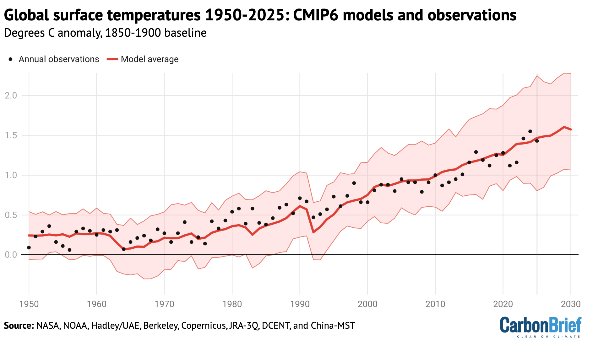
Here, Carbon Brief examines a collection of climate models – known as CMIP6 – used in the 2021 science report of the IPCC’s sixth assessment.
In CMIP6, model estimates of temperatures prior to 2015 are a “hindcast” using known past climate influences, while temperatures projected from 2015 onward are a “forecast” based on an estimate of how things might change.
The figure below shows how observations compare to the full ensemble of 37 CMIP6 models under the middle-of-the-road SSP2-4.5 emissions scenario for future projections. The red line represents the average of all the models and the red areas showing the 5th to 95th percentile range. The average of the eight observational temperature datasets are plotted as dots on top of the climate model data.
The chart illustrates how observations have generally been a bit below the model average over the past two decades, were slightly above model average in 2024 and are more or less dead on in 2025.
Annual global average surface temperatures from CMIP6 models and observations between 1950 and 2030 (through 2025 for observations). Models use the SSP2-4.5 scenario after 2015. Anomalies plotted with respect to a 1850-1900 baseline. Chart by Carbon Brief.
However, the ensemble of CMIP6 models differs from the main projection of future warming in the recent IPCC AR6 report. A subset of CMIP6 models have unrealistically high climate sensitivity and they reproduce historical observations poorly.
To account for this, rather than simply averaging all the models – as had been done in prior assessments – the IPCC employed an approach that effectively weights models by their performance. As a result, the models align better with the range of climate sensitivity derived from multiple different lines of evidence.
The chart below shows the assessed warming projections from the IPCC AR6 report in red, with historical observations since 1850 as black dots.
Annual global average surface temperatures from the average of eight datasets (black dots) along the 30-year LOWESS fit (red line), combined the AR6 assessed warming projection for SSP2-4.5 as published and without any baseline alignment. Chart by Carbon Brief.
The chart reveals that observed global surface temperatures (black dots) are further above the modeled central estimate 2023-25, but generally remain within the IPCC assessed range.
Climate models broadly expect an acceleration of warming in the current period in a scenario like SSP2-4.5 where emissions of CO2 and other greenhouse gases continue to modestly increase, but emissions of planet-cooling aerosols like sulphur dioxide are rapidly reduced.
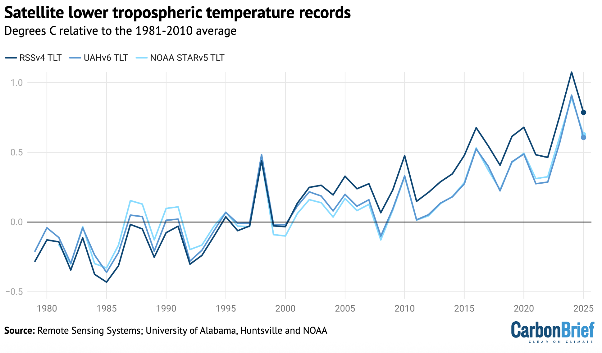
Second-warmest atmospheric temperatures
In addition to surface measurements over the world’s land and oceans, satellite microwave sounding units have been providing estimates of temperatures at various layers of the atmosphere since 1979.
The lowest layer of the atmosphere that satellite microwave units provide temperature estimates for is the lower troposphere. This data reflects temperatures a few kilometres above the Earth’s surface. It reveals a pattern of warming in the lowest troposphere that is similar – though not identical – to surface temperature changes.
The records produced by Remote Sensing Systems (RSS), the University of Alabama, Huntsville (UAH) and NOAA show 2025 as the second warmest year on record in the lower troposphere, after 2024. The chart below shows the three records for the lower troposphere, using a more recent baseline period (1981-2010) given the absence of satellite data before 1979.
Global average lower-troposphere temperatures from RSS version 4 (dark blue), UAH version 6 (mid-blue) and NOAA STAR version 5 (light blue) for the period from 1979-2025, relative to a 1981-2010 baseline. Chart by Carbon Brief.
The lower troposphere tends to be influenced more strongly by El Niño and La Niña events than the surface. Therefore, satellite records show correspondingly larger warming or cooling spikes during these events. This explains why there was both a bigger increase between 2023 and 2024 and a bigger decline between 2024 and 2025 in the satellite record than in surface records.
The lower-tropospheric temperature records show large differences after the early 2000s. RSS shows an overall rate of warming quite similar to surface temperature records, while UAH and NOAA show considerably slower warming in recent years than has been observed on the surface.
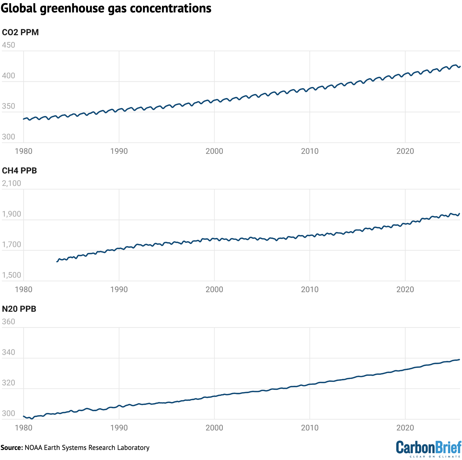
Greenhouse gas concentrations reach new highs
Greenhouse gas concentrations reached a new high in 2025, driven by human-caused emissions from fossil fuels, land use and agriculture.
Three greenhouse gases – CO2, methane (CH4) and nitrous oxide (N2O) – are responsible for the bulk of additional heat trapped by human activities. CO2 is by far the largest factor, accounting for roughly 42% of the increase in global surface temperatures since the pre-industrial era (1850-1900).
Methane accounts for 28%, while nitrous oxide accounts for around 5%. The remaining 25% comes from other factors including carbon monoxide, black carbon and halocarbons, such as chlorofluorocarbons (CFCs).
Human emissions of greenhouse gases have increased atmospheric concentrations of CO2, methane and nitrous oxide to their highest levels in at least a few million years – if not longer.
The figure below shows concentrations of these greenhouse gases – in parts per million (ppm) for CO2 and parts per billion (ppb) for methane and nitrous oxide – from the early 1980s through to October 2025 for CO2 and September 2025 for CH4 and N2O (the most recent data currently available).
Global concentrations of CO2, methane (CH4) and nitrous oxide (N2O). Based on data from NOAA’s Earth Systems Research Laboratory. Note that the y-axes do not start at zero. Chart by Carbon Brief.
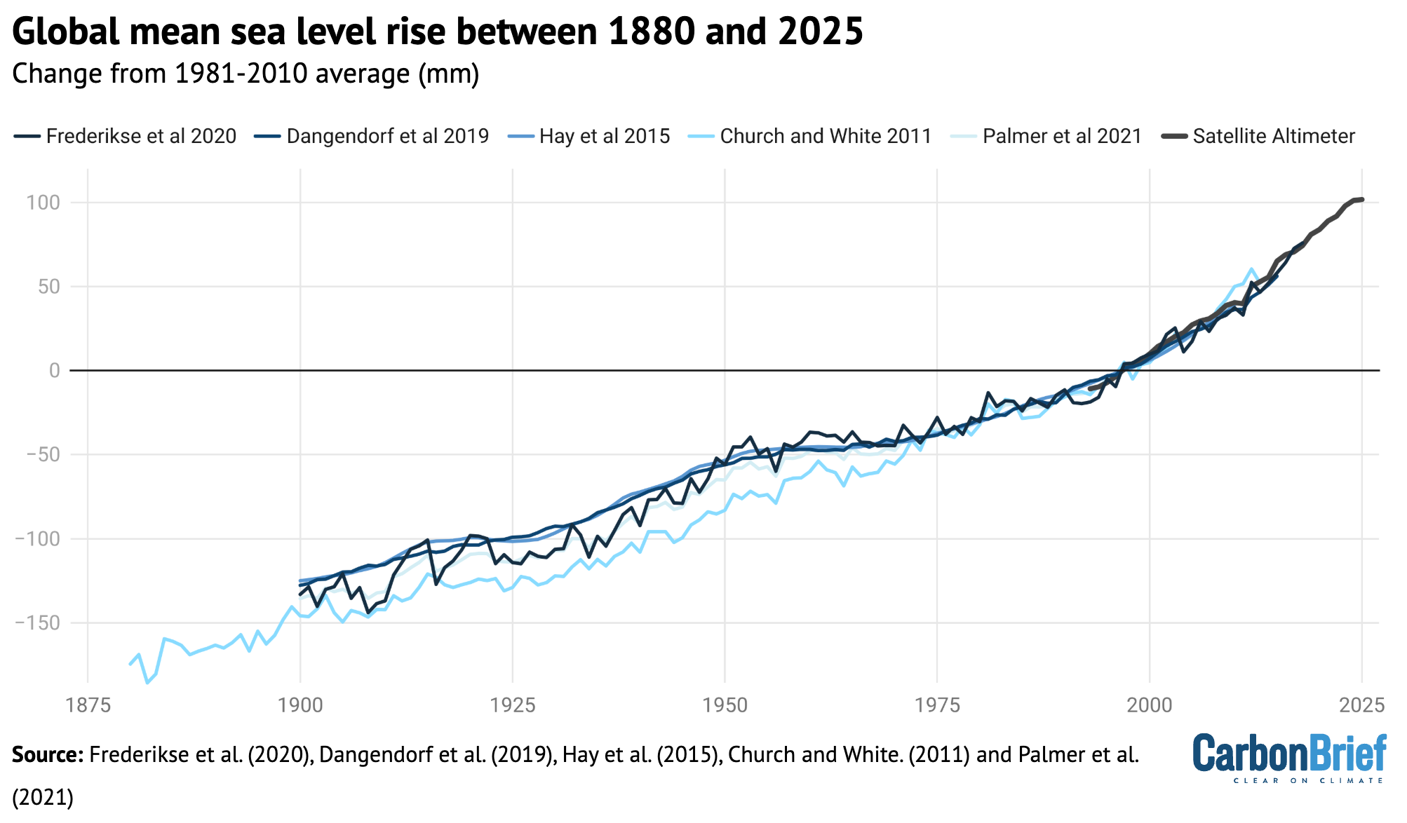
Sea level is rising rapidly
Modern-day sea levels have risen to a new high, due to a combination of melting land ice (such as glaciers and ice sheets), the thermal expansion of water as it warms and changes in land water storage.
In recent years, there have been larger contributions to sea level rise from melting ice sheets and glaciers, as warmer temperatures accelerate ice sheet losses in Greenland and Antarctica.
Since the early 1990s, the increase in global sea level has been estimated using altimeter data from satellites. Earlier global sea levels have been reconstructed from a network of global tide gauge measurements. This allows researchers to estimate how sea level has changed since the late 1800s.
The chart below shows five different modern sea level rise datasets (blue lines), along with satellite altimeter measurements as assessed by AVISO (in black) after 1993. (As sea level rise data has not yet been released for the whole year, the 2025 value is estimated based on data through to November.)
Global average sea level rise reconstructed from tide gauge data between 1880 and 2025 from Frederikse et al. (2020), Dangendorf et al. (2019), Hay et al. (2015), Church and White (2011), and Palmer et al. (2021). Satellite altimeter data from 1993 (black) to present is taken from AVISO. Chart by Carbon Brief.
Sea levels have risen by over 0.2 metres (200mm) since 1900. While sea level rise estimates mostly agree in recent decades, larger divergences are evident before 1980. There is also evidence of accelerating sea level rise over the post-1993 period when high-quality satellite altimetry data is available.
(To understand more on how climate change is accelerating sea level rise, read Carbon Brief’s explainer.)
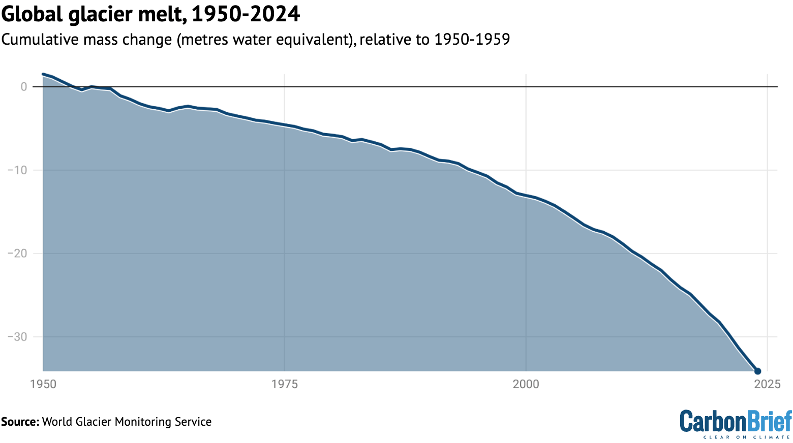
Shrinking glaciers and ice sheets
A significant portion of global sea level rise is being driven by melting glaciers on land.
Scientists measure the mass of glaciers around the world using a variety of remote-sensing techniques, as well as through GRACE measurements of the Earth’s gravitational field. The balance between snow falling on a glacier and ice loss through melting and the breaking off – or “calving” – of icebergs determines if glaciers grow or shrink over time.
The World Glacier Monitoring Service is an international consortium that tracks more than 130 different glaciers in 19 different regions around the world. The figure below shows the change in global average glacier mass from 1950 through to the end of 2024. (2025 values are not yet available.) Note that glacier melt is reported in metres of water equivalent, which is a measure of how much mass has been lost on average.
Global average glacier melt over the 1950-2024 period from the World Glacier Monitoring Service, in metres of water equivalent. Carbon Brief.
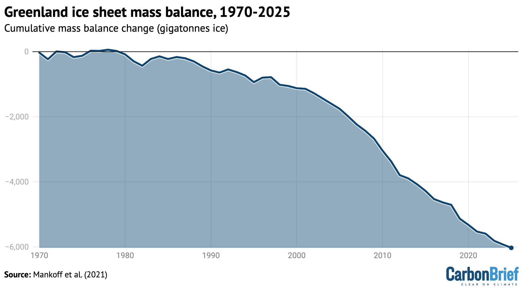
Greenland ice sheets have become a larger contributor to sea level rise in recent years due to accelerating loss of mass. The year 2025 was the 29th in a row where Greenland lost ice overall, with 105bn tonnes of ice lost over the 12 months from September 2024 to August 2025. Greenland last saw an annual net gain of ice in 1996.
The figure below shows the cumulative mass balance change – that is, the net ice loss – from Greenland between 1970 and 2025. The authors find that Greenland has lost around 6tn tonnes of ice over the past 50 years – more than 700 tonnes lost per person for every person on the planet.
Cumulative ice loss from Greenland in billion metric tonnes (gigatonnes) between 1970 and 2025 from Mankoff et al 2021. Chart by Carbon Brief.
Lowest winter Arctic sea ice extent
Arctic sea ice saw its lowest winter peak on record as well as its 10th-lowest summer minimum extent, while Antarctic sea ice saw its third-lowest minimum extent.
Both the Arctic and Antarctic were at the low end of the historical (1979-2010) range for most of 2025, with new daily lows recorded for Arctic sea ice extent in January, February, March, June and December.
The figure below shows both Arctic (red line) and Antarctic (blue line) sea ice extent for each day of the year, along with how it compares to the historical range (corresponding shading).
Arctic and Antarctic daily sea ice extent from the US National Snow and Ice Data Center. The bold lines show daily 2025 values, the shaded area indicates the two standard deviation range in historical values between 1979 and 2010. The dotted black lines show the record lows for each pole. Chart by Carbon Brief.
Looking ahead to 2026
There is reason for caution when estimating likely temperatures for 2026.
In 2023, temperatures were significantly higher than predictions made at the start of the year, while 2024 temperatures were towards the high end of annual predictions. Temperatures in 2025 were more in-line with predictions, albeit still on the higher side for three out of the four predictions included above.
There are currently weak La Niña conditions currently present in the tropical Pacific, which are expected to extend through February. This would somewhat suppress temperatures in the first half of the year. However, the latest forecasts suggest a growing likelihood of El Niño conditions developing by June, which may lead to warmer temperatures in late 2026 – and potentially much warmer temperatures in 2027.
Carbon Brief predicts that global average surface temperatures in 2026 are likely to be between the second and fourth warmest on record, similar to 2023 and 2025, at around 1.4C above pre-industrial levels.
The figure below shows the four different 2026 predictions compared to the average of eight different temperature records explored in this article. (These have been “normalised” to show 2026 warming relative to the 2023-25 average to allow a clear comparison, given that each of the predictions was originally presented for a different temperature record.)
Carbon Brief’s prediction of likely 2026 temperatures is based on a statistical model using the average temperature of the past year, the latest monthly temperature and projections of ENSO conditions over the first three months of 2026.
Temperature projections for 2026 from the Met Office, NASA’s Dr Gavin Schmidt, Berkeley Earth and Carbon Brief, relative to pre-industrial (1850-1900) temperatures and compared to the historical average of eight different surface temperature datasets. Chart by Carbon Brief.
The Met Office, Dr Schmidt, Berkeley Earth and Carbon Brief estimates all have 2026 ending up as somewhere between the second- and fourth-warmest year on record, with the best estimate as being more or less tied with 2023 and 2025.
There is a very small chance that 2026 could end up beating 2024 as the warmest year on record, or end up below 2016 as the fifth or sixth warmest year.
However, with the growing likelihood of El Niño conditions developing in the second half of 2026, it is increasingly likely that 2027 will challenge 2024 for the title of the warmest year on record. The rate of warming has notably accelerated over the past 15 years and the period of exceptionally warm years that started in 2023 shows no signs of abating.
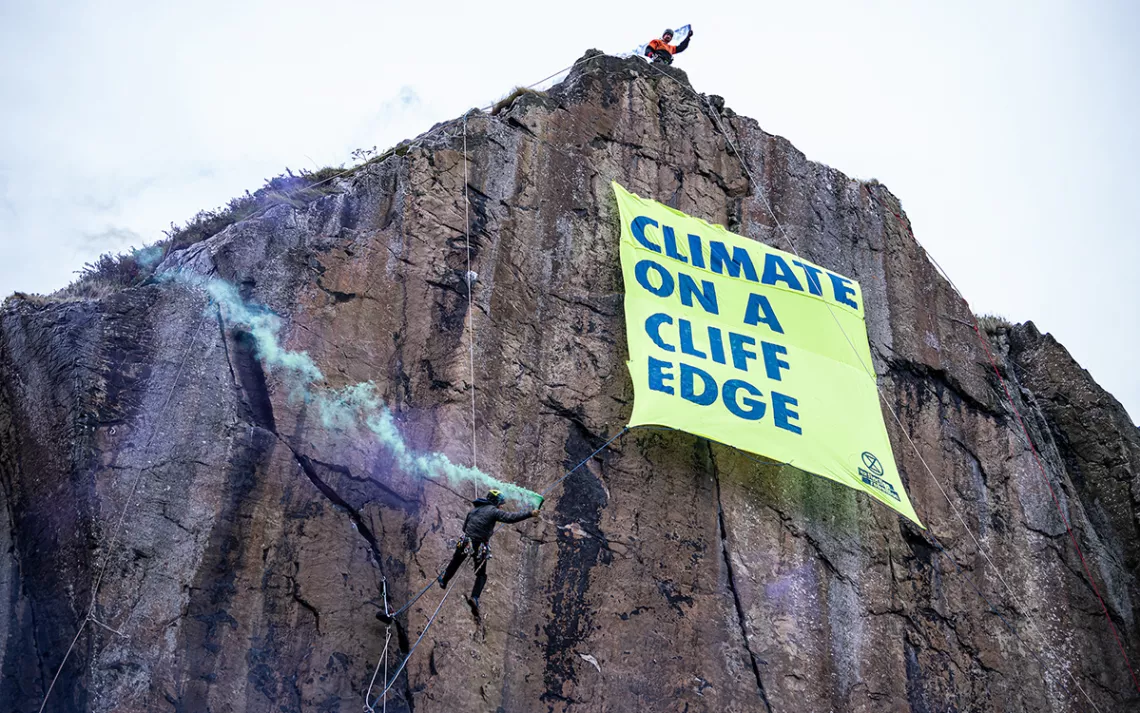
Experienced climbers scale a rock face near the historic Dumbarton castle in Glasgow, releasing a banner that reads “Climate on a Cliff Edge.” One activist, dressed as a globe, symbolically looms near the edge, while another plays the bagpipes on the shores below. | Photo courtesy of Extinction Rebellion and Mark Richards
Donald Trump urges you to be a Climate Science denier like him. He says that he makes millions and millions for destroying the planet, Burn, Baby, Burn and Flood, Baby, Flood.Nigel Farage urges you to ignore facts and reality and be a climate science denier like him and his Deputy Richard Tice. He says that Reform UK has received £Millions and £Millions from the fossil fuel industry to promote climate denial and destroy the planet.
The year 2025 saw the return to power of Donald Trump, a jewellery heist at the Louvre museum in Paris and an engagement that “broke the internet”.
Amid the biggest stories of the year, climate change research continued to feature prominently in news and social media feeds.
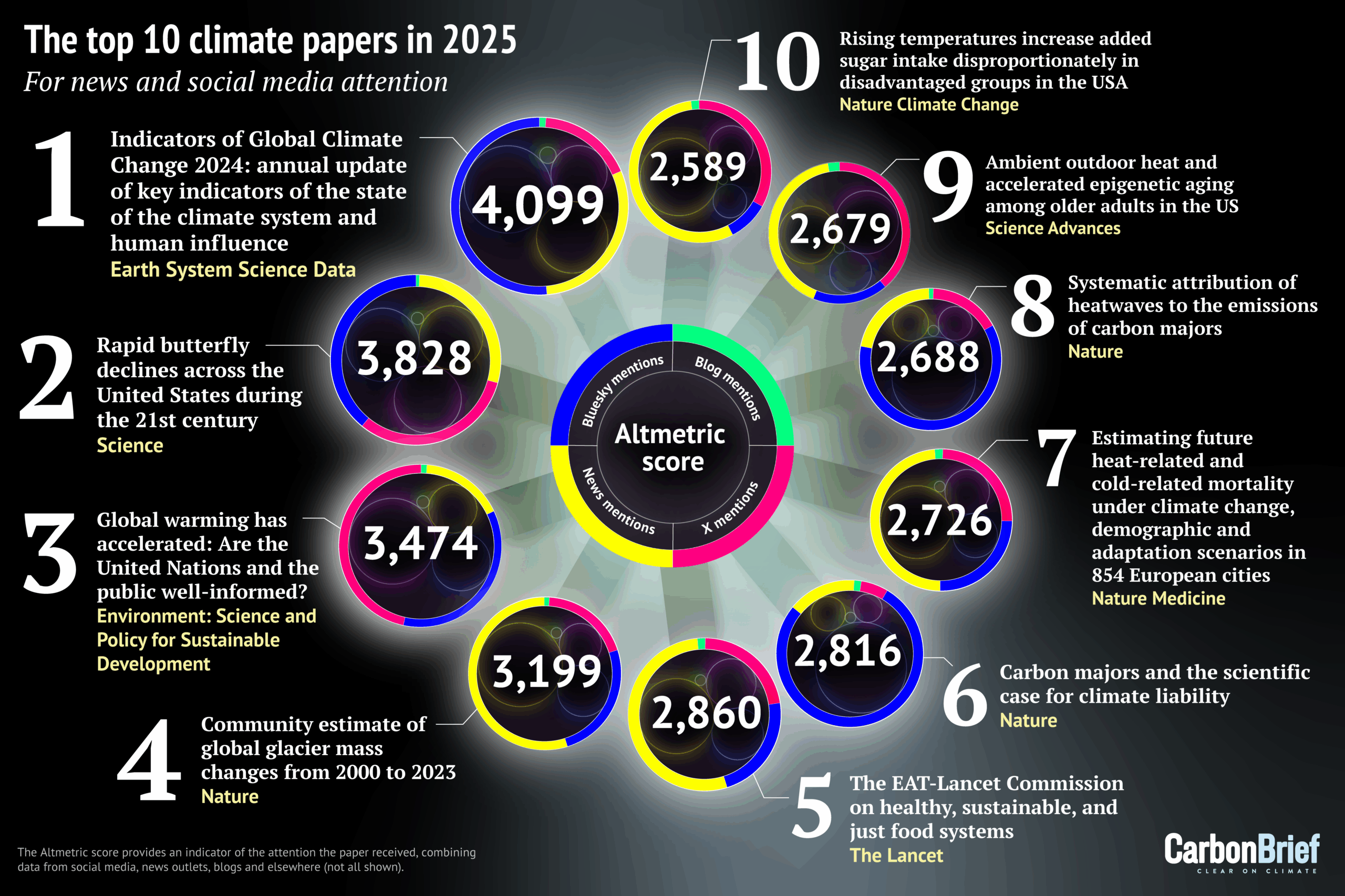
Using data from Altmetric, which scores research papers according to the attention they receive online, Carbon Brief has compiled its annual list of the 25 most talked-about climate-related studies of the past year.
The top 10 – shown in the infographic above and list below – include research into declining butterflies, heat-related deaths, sugar intake and the massive loss of ice from the world’s glaciers:
Later in this article, Carbon Brief looks at the rest of the top 25 and provides analysis of the most featured journals, as well as the gender diversity and country of origin of authors.
New for this year is the inclusion of Altmetric’s new “sentiment analysis”, which scores how positive or negative a paper’s social media attention has been.
The top-scoring climate paper of 2025, ranking 24th of any research paper on any topic, is the annual update of the “Indicators of Global Climate Change” (IGCC) report.
The report was established in 2023 to help fill the gap in climate information between assessments of the Intergovernmental Panel on Climate Change (IPCC), which can take up to seven years to complete. It includes the latest data on global temperatures, the remaining carbon budget, greenhouse gas emissions and – for the first time – sea level rise.
The paper, published in Earth System Science Data, has an Altmetric score of 4,099. This makes it the lowest top-scoring climate paper in Carbon Brief’s list since 2017.
(An Altmetric score combines the mentions that published peer-reviewed research has received from online news articles, blogs, Wikipedia and on social media platforms such as Facebook, Reddit, Twitter and Bluesky. See an earlier Carbon Brief article for more on how Altmetric’s scoring system works.)
Previous editions of the IGCC have also appeared in Carbon Brief’s list – the 2024 and 2023 iterations ranked 17th and 18th, respectively.
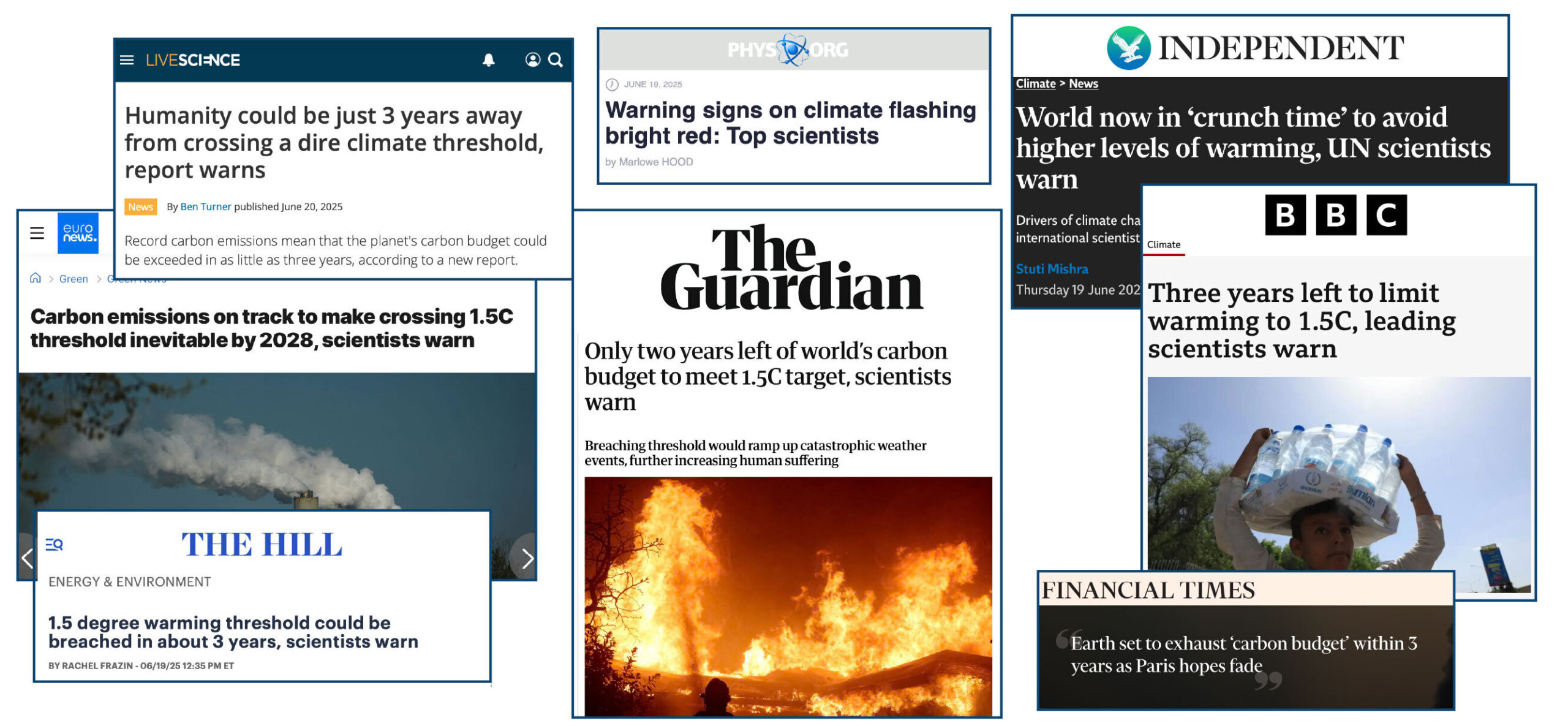
Many outlets led their coverage with the study’s findings on the global “carbon budget”. This warned that the remaining carbon budget to limit warming to 1.5C will be exhausted in just three years if global emissions continue at their current rate.
“It is also now inevitable that global temperatures will reach 1.5C of long-term warming in the next few years unless society takes drastic, transformative action…Every year of delay brings reaching 1.5C – or even higher temperatures – closer.”
Forster, who was awarded a CBE in the 2026 new year honours list, tells Carbon Brief that media coverage of the study was “great” at “putting recent extreme weather in the context of rapid long-term rates of global warming”.
However, he adds:
“Climate stories are not getting the coverage they deserve or need at the moment so the community needs to get all the help we can for getting clear consistent messages out there.”
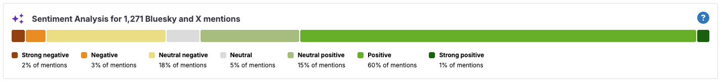
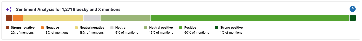
The paper was tweeted more than 300 times and posted on Bluesky more than 950 times. It also appeared in 22 blogs.
Using AI, Altmetric now analyses the “sentiment” of this social media attention. As the summary figure below shows, the posts about this paper were largely positive, with an approximate 3:1 split of positive and negative attention.
Altmetric’s AI-generated summary of the sentiment of social media posts regarding the Forster et al. (2025) paper. Totals may add up to more than 100% because of rounding. Source: Altmetric
Butterfly decline
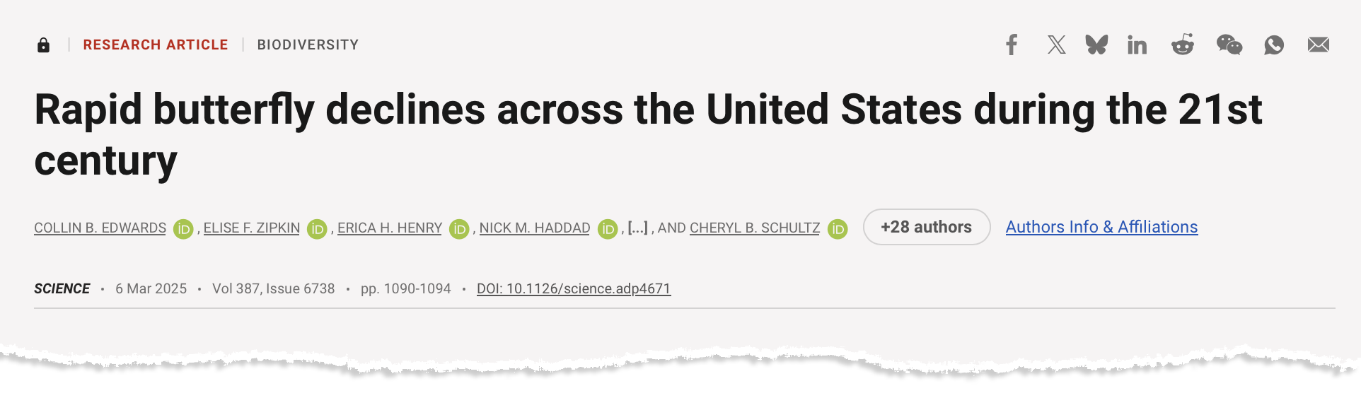
With an Altmetric score of 3,828, the second-highest scoring climate paper warns of “widespread” declines in butterfly numbers across the US since the turn of the century.
The paper, titled “Rapid butterfly declines across the US during the 21st century” and published in Science, identifies a 22% fall in butterfly numbers across more than 500 species between 2000 and 2020.
(There is a higher-scoring paper, “The 2025 state of the climate report: a planet on the brink”, in the journal BioScience, but it is a “special report” and was not formally peer reviewed.)
The scale of the decline suggests “multiple and broadly acting threats, including habitat loss, climate change and pesticide use”, the paper says. The authors find that “species generally had stronger declines in more southerly parts of their ranges”, with some of the most negative trends in the driest and “most rapidly warming” US states.
The paper was also mentioned in 13 blogs, more than 750 Bluesky posts and more than 600 tweets.
The sentiment analysis reveals that social media posts about the paper were largely negative. However, closer inspection reveals that this negativity is predominantly towards the findings of the paper, not the research itself.
For example, a Bluesky post on the “distressing” findings by one of the study’s authors is designated as “neutral negative” by Altmetric’s AI analysis.
In a response to a query from Carbon Brief, Altmetric explains that the “goal is to measure how people feel about the research paper itself, not the topic it discusses”. However, in some cases the line can be “blurred” as the AI “sometimes struggles to separate the subject matter from the critique”. The organisation adds that it is “continuously working on improving our models to better distinguish between the post’s content and the research output”.
Altmetric’s AI-generated summary of the sentiment of social media posts regarding the Forster et al. (2025) paper. Totals may add up to more than 100% because of rounding. Source: Altmetric
On the attention that the paper received, lead author Dr Collin Edwards of the Washington Department of Fish & Wildlife says that “first and foremost, people care about butterflies and our results are broad-reaching, unequivocal and, unfortunately, very concerning”.
Edwards tells Carbon Brief he hopes the clarity of the writing made the paper accessible to readers, noting that he and his co-authors “sweat[ed] over every word”.
The resulting news coverage “accurately captured the science”, Edwards says:
“Much as I wish our results were less consistently grim, the consistency and simplicity of our findings mean that even if a news story only provides the highest level summary, it isn’t misleading readers by skipping some key caveat or nuance that changes the interpretation.”
The findings suggest that the cooling effect of aerosols – tiny, light‑scattering particles produced mainly by burning fossil fuels – has masked more of the warming driven by greenhouse gases than previously estimated by the IPCC.
As efforts to tackle air pollution continue to reduce aerosol emissions, warming will accelerate further – reaching 2C by 2045, according to the research.
The paper was covered by almost 400 news stories – driven, in part, by Hansen’s comments in a press briefing that the Paris Agreement’s 2C warming limit was already “dead”.
Hansen’s analysis received a sceptical response from some scientists. For example, Dr Valerie Masson-Delmotte, an IPCC co-chair for its most recent assessment report on climate science, told Agence France-Presse the research “is not published in a climate science journal and it formulates a certain number of hypotheses that are not consistent with all the available observations”.
In addition, other estimates, including by Carbon Brief, suggest new shipping regulations have made a smaller contribution to warming than estimated by Hansen.
Hansen tells Carbon Brief that the paper “did ok” in terms of media coverage, although notes “it’s on [scientists] to do a better job of making clear what the core issues are in the physics of climate change”.
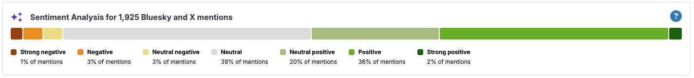
With more than 1,000 tweets, the paper scored highest in the top 25 for posts on Twitter. It was also mentioned in more than 800 Bluesky posts and on 27 blogs.
The sentiment analysis suggests that these posts were largely positive, with just a small percentage of negative comments.
Altmetric’s AI-generated summary of the sentiment of social media posts regarding the Hansen et al. (2025) paper. Totals may add up to more than 100% because of rounding. Source: Altmetric
Making the top 10
Ranking fourth in Carbon Brief’s analysis is a Nature paper calculating changes in global glacier mass over 2000-23. The study finds glaciers worldwide lost 273bn tonnes of ice annually over that time – with losses increasing by 36% between 2000-11 and 2012-23.
The study has an Altmetric score of 3,199. It received more news coverage than any other paper in this year’s top 25, amassing 1,187 mentions. with outlets including the Guardian, Associated Press and Economic Times.
Carbon Brief’s coverage of the report highlights that “a global shift towards ‘healthier’ diets could cut non-CO2 greenhouse gas emissions, such as methane, from agriculture by 15% by 2050”. It adds:
“The findings build on the widely cited 2019 report from the EAT-Lancet Commission – a group of leading experts in nutrition, climate, economics, health, social sciences and agriculture from around the world.”
Also making the top 10 – ranking sixth and eighth – are a pair of papers published in Nature, which both link extreme heat to the emissions of specific “carbon majors” – large producers of fossil fuels, such as ExxonMobil, Shell and Saudi Aramco,.
The first is a perspective, titled “Carbon majors and the scientific case for climate liability”, published in April. It begins:
“Will it ever be possible to sue anyone for damaging the climate? Twenty years after this question was first posed, we argue that the scientific case for climate liability is closed. Here we detail the scientific and legal implications of an ‘end-to-end’ attribution that links fossil fuel producers to specific damages from warming.”
The authors find “trillions (of US$) in economic losses attributable to the extreme heat caused by emissions from individual companies”.
The paper was mentioned 1,329 times on Bluesky – the highest in this year’s top 25. It was also mentioned in around 270 news stories.
Published four months later, the second paper uses extreme event attribution to assess the impact of climate change on more than 200 heatwaves recorded since the year 2000.
The authors find one-quarter of the heatwaves would have been “virtually impossible” without human-caused global warming. They add that the heatwaves were, on average, 1.7C hotter due to climate change, with half of this increase due to emissions stemming from the operations and production of carbon majors.
This study was mentioned in almost 300 news stories – including by Carbon Brief – as well as 222 tweets and 823 posts on Bluesky.
In seventh place is a Nature Medicine study, which quantifies how heat-related and cold-related deaths will change over the coming century as the climate warms.
A related research briefing explains the main findings of the paper:
“Heat-related deaths are estimated to increase more rapidly than cold-related deaths are estimated to decrease under future climate change scenarios across European cities. An unrealistic degree of adaptation to heat would be required to revert this trend, indicating the need for strong policies to reduce greenhouse gases emissions.”
The paper in ninth place also analyses the health impacts of extreme heat. The study, published in Science Advances, finds that extreme heat can speed up biological ageing in older people.
Rounding out the top 10 is a Nature Climate Change study, titled “Rising temperatures increase added sugar intake disproportionately in disadvantaged groups in the US”.
The study finds that at higher temperatures, people in the US consume more sugar – mainly due to “higher consumption of sugar-sweetened beverages and frozen desserts”. The authors project that warming of 5C would drive additional sugar consumption of around 3 grams per day, “with vulnerable groups at an even higher risk”.
In 13th place is a Nature Climate Change study that finds the wealthiest 10% of people – defined as those who earn at least €42,980 (£36,605) per year – contributed seven times more to the rise in monthly heat extremes around the world than the global average.
The authors also explore country-level emissions, finding that the wealthiest 10% in the US produced the emissions that caused a doubling in heat extremes across “vulnerable regions” globally.
In 15th place is the annual Lancet Countdown on health and climate change – a lengthy report with more than 120 authors.
The study warns that “climate change is increasingly destabilising the planetary systems and environmental conditions on which human life depends”.
This annual analysis from the Lancet often features in Carbon Brief’s top 25 analysis. After three years in the Carbon Brief’s top 10 over 2020-23, the report landed in 20th place in 2023 and missed out on a spot in the top 25 altogether in 2024.
In 16th place is a Science Advances study, titled “Increasing rat numbers in cities are linked to climate warming, urbanisation and human population”. The study uses public complaint and inspection data from 16 cities around the world to estimate changes in rat populations.
It finds that “warming temperatures and more people living in cities may be expanding the seasonal activity periods and food availability for urban rats”.
In 21st place is a Nature Climate Change paper, titled “Peak glacier extinction in the mid-21st century”. The study authors “project a sharp rise in the number of glaciers disappearing worldwide, peaking between 2041 and 2055 with up to ~4,000 glaciers vanishing annually”.
Completing the top 25 is a Nature study on the “prudent planetary limit for geological carbon storage” – where captured CO2 is injected deep underground, where it can stay trapped for thousands of years.
In a Carbon Brief guest post, study authors Dr Matthew Gidden and Prof Joeri Rogelj explain that carbon dioxide removal will only be effective at limiting global temperature rise if captured CO2 is injected “deep underground, where it can stay trapped for thousands of years”.
The guest post warns that “geological carbon storage is not limitless”. It states that “if all available safe carbon storage capacity were used for CO2 removal, this would contribute to only a 0.7C reduction in global warming”.
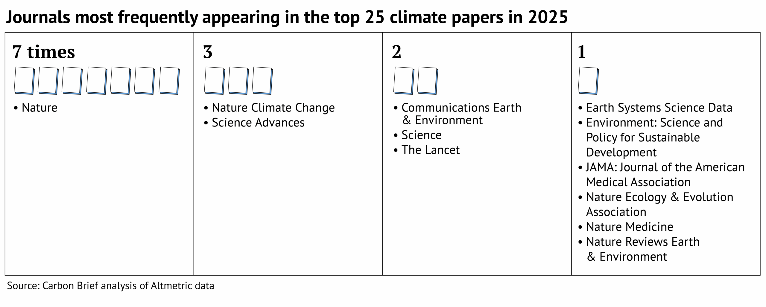
Top journals
The journal Nature dominates Carbon Brief’s top 25, with seven papers featured.
Many other journals in the Springer Nature stable also feature, including Nature Climate Change (three), Communications Earth & Environment (two), as well as Nature Ecology & Evolution, Nature Medicine and Nature Reviews Earth & Environment (one each).
Also appearing more than once in the top 25 are Science Advances (three), Science (two) and the Lancet (two).
This is shown in the graphic below.
All the final scores for 2025 can be found in this spreadsheet.
Diversity in the top 25
The top 25 climate papers of 2025 cover a huge range of topics and scope. However, analysis of their authors reveals a distinct lack of diversity.
In total, the top 25 includes more than 650 authors – the highest number since Carbon Brief began this analysis in 2022.
This is largely due to a few publications with an exceptionally high number of authors. For example, the 2025 report of the Lancet Countdown on health and climate change has almost 130 authors alone, accounting for almost one-fifth of authors in this analysis.
Carbon Brief recorded the gender and country of affiliation for each of these authors. (The methodology used was developed by Carbon Brief for analysis presented in a special 2021 series on climate justice.)
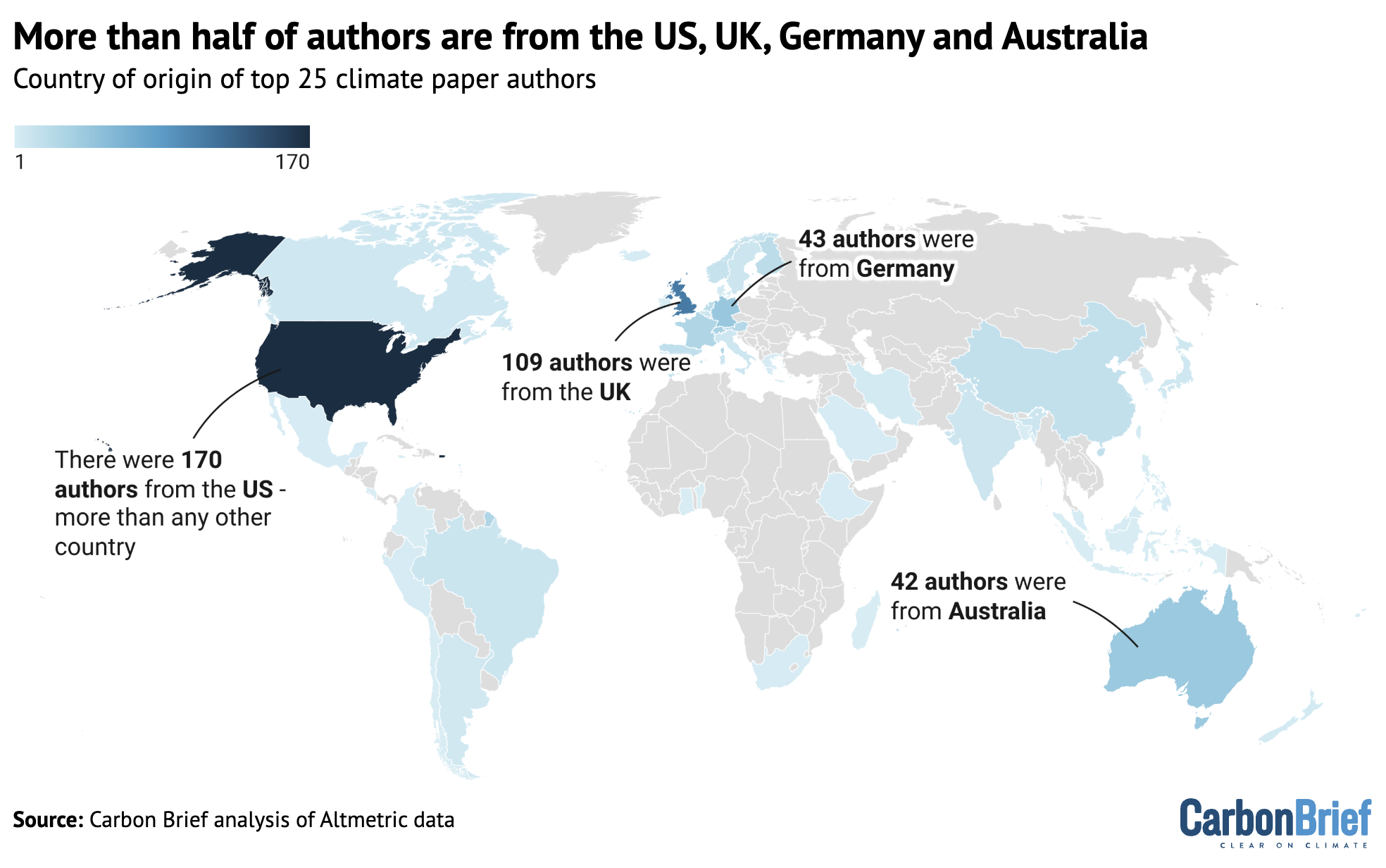
The analysis reveals that 88% of the authors of the climate papers most featured in the media in 2025 are from institutions in the global north.
Global South: The “global south” is a term used to broadly describe lower-income countries in regions such as Africa, Asia and Latin America. It is often used to denote nations that are either in… Read More
Carbon Brief defines the global north as North America, Europe, Japan, Australia and New Zealand. It defines the global south as Asia (excluding Japan), Africa, Oceania (excluding Australia and New Zealand), Latin America and the Caribbean.
The analysis shows that 53% of authors are from European institutions, while only 1% of authors are from institutions in Africa.
Further data analysis shows that there are also inequalities within continents. The map below shows the percentage of authors from each country, where dark blue indicates a higher percentage. Countries that are not represented by any authors in the analysis are shown in grey.
The number of all authors from the climate papers most featured in the media in 2025. The designations employed and the presentation of the material on this map do not imply the expression of any opinion whatsoever on the part of Carbon Brief concerning the legal status of any country, territory, city or area or of its authorities, or concerning the delimitation of its frontiers or boundaries. Map by Carbon Brief using Datawrapper.
The top-ranking countries on this map are the US and the UK, which account for 26% and 16% of the authors, respectively.
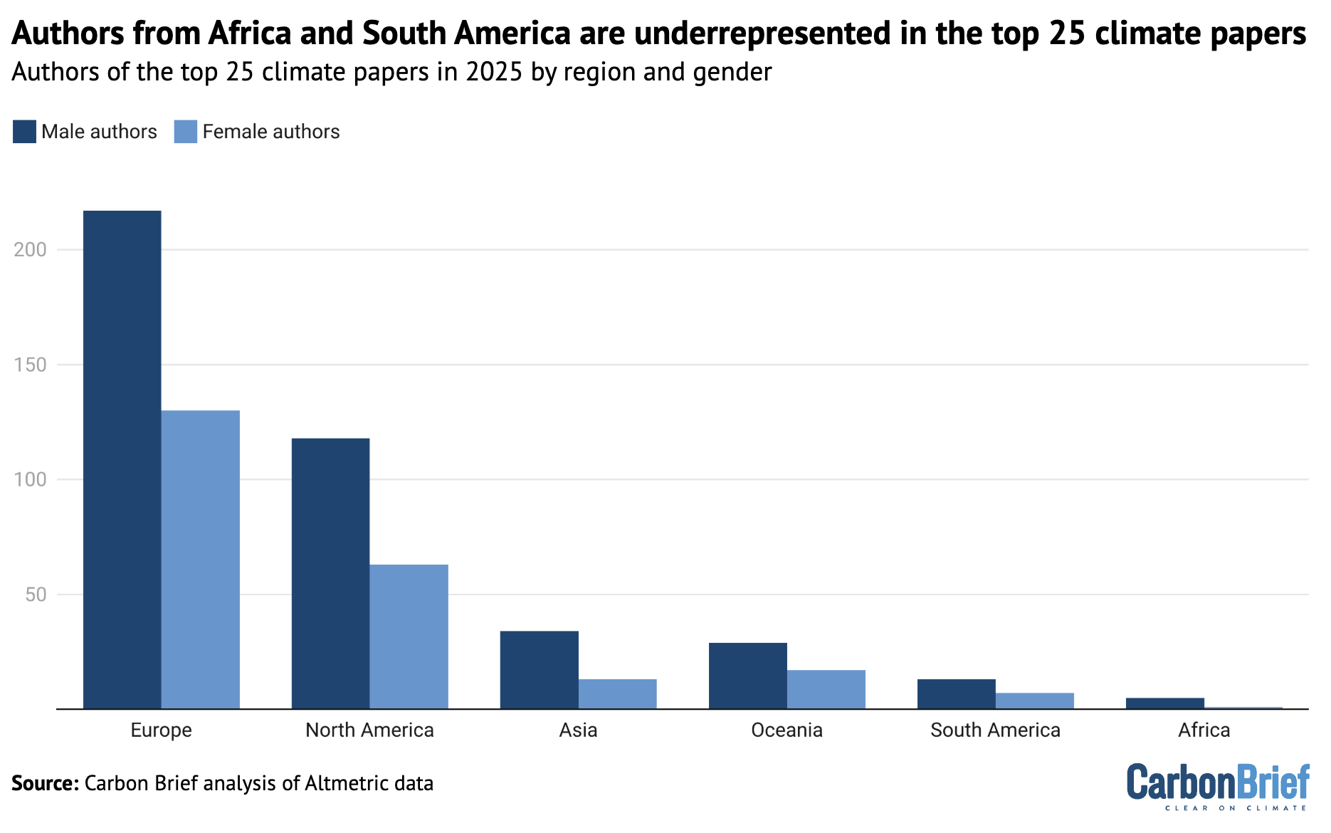
Carbon Brief also analysed the gender of the authors.
Only one-third of authors from the top 25 climate papers of 2025 are women and only five of the 25 papers list a woman as lead author.
The plot below shows the number of authors from each continent, separated into men (dark blue) and women (light blue).
The number of men (dark blue) and women (light blue) listed as authors in the climate papers most featured in the media in 2025, shown by continent. Chart by Carbon Brief using Datawrapper.
The full spreadsheet showing the results of this data analysis can be found here. For more on the biases in climate publishing, see Carbon Brief’s article on the lack of diversity in climate-science research.
Elon Musk urges you to be a Fascist like him, says that you can ignore facts and reality then.Donald Trump urges you to be a Climate Science denier like him. He says that he makes millions and millions for destroying the planet, Burn, Baby, Burn and Flood, Baby, Flood.Orcas discuss Donald Trump and the killer apes’ concept of democracy. Front Orca warns that Trump is crashing his country’s economy and that everything he does he does for the fantastically wealthy.
This work by Middle East Monitor is licensed under a Creative Commons Attribution-NonCommercial-ShareAlike 4.0 International License
A general view from Cebel al-Baba (Mount Baba) area following Israeli far-right Finance Minister Bezalel Smotrich’s approval of the “E1” project in Jerusalem on August 15, 2025. [ Issam Rimawi – Anadolu Agency]
2025 closed as a record-breaking year for illegal Israeli settlement expansion in the occupied West Bank, with Israel’s far-right coalition approving an unprecedented number of new settlements and housing projects – a push rights groups say is aimed at annexing the territory and blocking Palestinian statehood.
According to Israeli settlement watchdog Peace Now, the approvals finalized this year capped an acceleration that began under the current government, surpassing any period since the Oslo Accords were signed in 1993.
“This is nothing to compare to previous governments,” Yonatan Mizrachi of Peace Now’s Settlement Watch Team told Anadolu.
“The goal of this government … is to prevent a political solution based on a two-state solution,” he said.
41 settlements approved in 2025
Peace Now said plans for 41 new illegal settlements were approved in 2025, making it the most extensive single year of settlement approvals on record. The figure includes both newly announced settlements and the retroactive legalization of previously unauthorized outposts.
In May, Israel’s Security Cabinet approved the construction of 22 new illegal settlements on Palestinian land in the occupied West Bank – the largest expansion in decades.
The move included the reestablishment of settlements in Homesh and Sa-Nur, which were dismantled under Israel’s 2005 unilateral disengagement from the Gaza Strip.
On Dec. 21, the Security Cabinet approved an additional plan to legalize 19 more settlements in the occupied West Bank, some newly established and others long-standing outposts now granted formal status.
Mizrachi said the current government moved quickly after taking office, legalizing 10 outposts in early 2023 and transforming nine of them into settlements.
Outposts are illegal even under Israeli law, while settlements are considered legal by Israel despite being illegal under international law.
Altogether, 68 settlements have been approved, legalized or initiated over the past three years, Peace Now said.
“This does not mean that all 68 settlements have already been established” Mizrachi said. “It means the process has begun – with government support, different planning committees and authorities.”
Spread across entire West Bank
The expansion is geographically wide-ranging, extending into areas where no settlements previously existed.
“Sixty-eight settlements that will be built according to the Israeli plan from the south to the north or from the north to the south,” said Mizrachi. “Including areas that today we don’t have any settlements like areas around Jenin, around Hebron.”
“It’s all over the West Bank actually,” he added.
In early 2023, there were more or less 140 settlements in the occupied West Bank, Mizrachi said. With recent approvals, that number has risen to 208.
The total number of Israeli settlers in East Jerusalem and the West Bank now stands at about 750,000.
Settlement expansion has also accelerated through construction approvals.
Peace Now on its website said Israeli authorities advanced plans for 28,163 settler housing units in 2025 – the highest figure ever recorded.
On the final day of the year, Israeli authorities approved a plan allowing settlers to return to Sa-Nur, greenlighting 126 housing units at the site evacuated in 2005, according to Israeli media.
The move was enabled by amendments introduced by the current government to the Disengagement Law, lifting restrictions on Israeli presence in parts of the northern West Bank.
Peace Now said the approval marks a return to settlement activity deep inside the northern West Bank, in densely populated Palestinian areas where settlers had not previously been present.
Blocking Palestinian statehood
Mizrachi said settlement expansion is central to the government’s strategy to prevent Palestinian statehood without formally declaring annexation.
“In the last three years, Israel has taken many steps – bureaucratic steps, advancing settlements, developing the West Bank – to increase the number of Israeli settlers,” he said.
“The aim is to prevent a Palestinian state in any political solution, because there will be so many settlements and so many locations with an Israeli presence that it would be much more difficult to evacuate.”
He said pressure from settler movements has intensified, pushing the government toward de facto annexation while avoiding a formal declaration due to international and US pressure.
B’Tselem, the Israeli Information Center for Human Rights in the Occupied Territories, spokesperson Yair Dvir said the settlement drive is accompanied by the forcible displacement of Palestinians.
“Israel continues to advance ethnic cleansing in the West Bank, both through the construction and retroactive legalization of outposts and new settlements, and through the forcible displacement of Palestinian communities and the violent takeover of vast areas of Palestinian lands,” he told Anadolu.
Concerns for 2026
Looking ahead, Mizrachi said settlement expansion is likely to continue into 2026, an election year in Israel.
“We are assuming that the advancing of settlement, house units, financial support to the settlers will continue in 2026 – it might increase or might not,” he said. “But definitely, the pattern that we have seen in the last three years will continue.”
He added that since October 2023, dozens of Palestinian communities have been forced to flee due to settler violence.
“Many times, an outpost is built next to the Palestinian community, making it more tense for the Palestinians to stay there,” he said. “We still see a lot of settler violence, much of it coming from illegal outposts.”
Mizrachi warned the trajectory is deepening instability.
“Instead of going toward a political solution that would mean withdrawing from the West Bank,” he said, “we are just going deeper into a more problematic situation.”
This work by Middle East Monitor is licensed under a Creative Commons Attribution-NonCommercial-ShareAlike 4.0 International License
Keir Starmer objects to criticism of the IDF. He asks how could anyone object to them starving people to death, forced marches like the Nazis did, bombing Gaza’s hospitals and universities, mass-murdering journalists, healthworkers and starving people queuing for food, killing and raping prisoners and murdering children. He calls for people to stop obstructing his genocide for Israel.Orcas discuss Genocide-supporting and complicit Zionists. Donald Trump, Keith Starmer, David Lammy, Rachel Reeves, Angela Rayner and Wes Streeting are acknowledged as evil genocide-complicit and supporting cnuts.Vote Labour for Genocide.